This is an interactive online guide to the evolution of modern art movements accessible on any device. As a responsive web-based application, the ideas behind modern art are explained, and the timelines to the movement are supplemented by further information as to where one can mind major collections and artworks. Arranged with plentiful illustrations, the exhibits and prose allow users to trace fascinating patterns of influence and reactions across time and place to experience the rise of the avant-garde artists that shaped modern art as we know it.
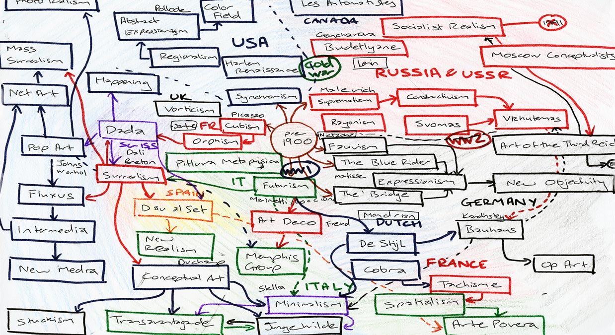
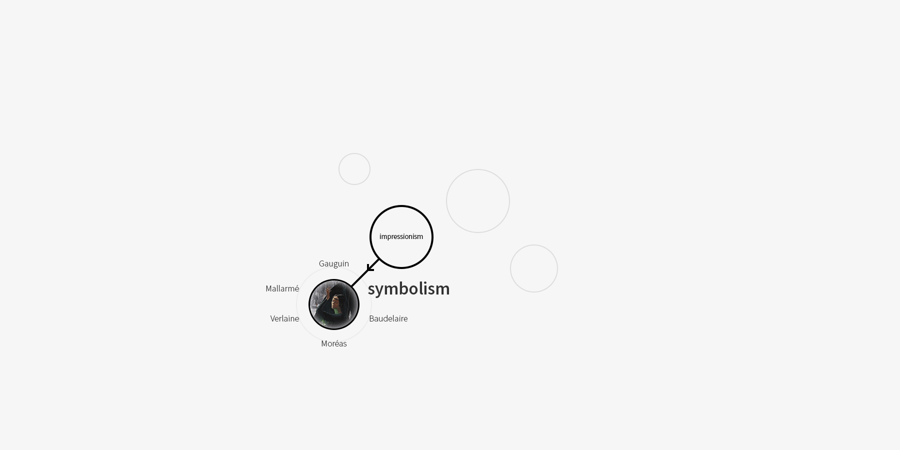
At the very beginning, these sketches were developed for the project based on various design considerations such as geography, chronology and the evolution of modern art. A mind-map developed earlier in the process helped pre-visualise all the research findings. Visual elements such as colours, node sizes and positions convey countries, influence and other relationships.
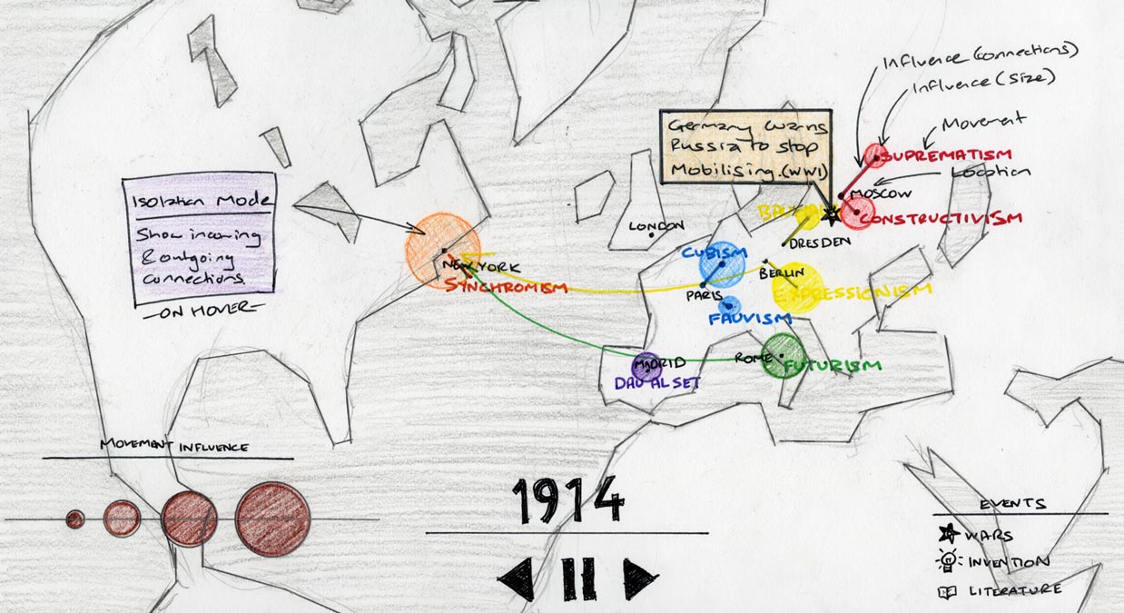
Derived from the mind-map the geographical shows art movements laid out based on their locations in the North Atlantic region. A timeline allows the user to witness how these movements influenced one another over time. In addition to geographic accuracy, the layout gives special importance to historic events in the modern era and their direct influence on modern art.
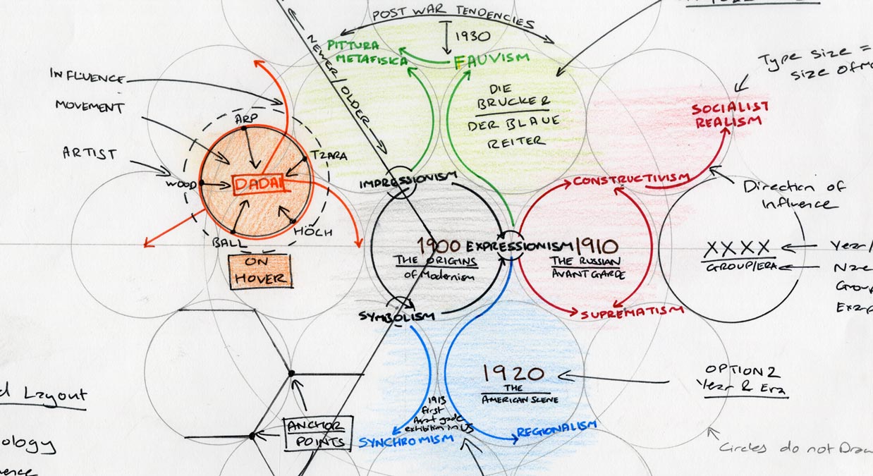
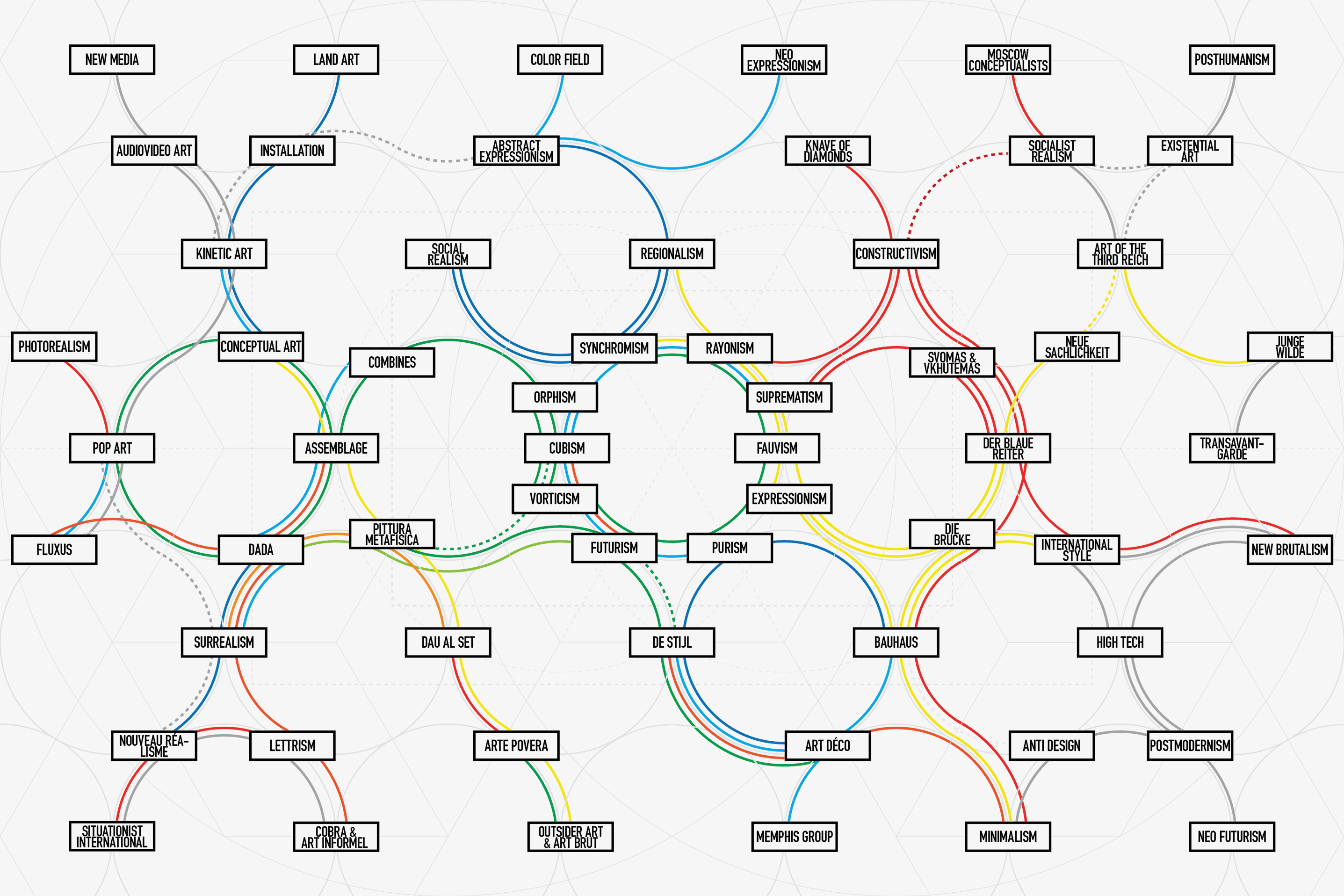
An alternate approach spreads all the art movements in a uniformly spaced chronological layout on a hexagonal grid. Primary importance was given to chronology with the roots of modernism at the centre and post-modern movements branching outwards. The layout allowed for a cleaner illustration but at the cost of compromising geographical and relational accuracy.
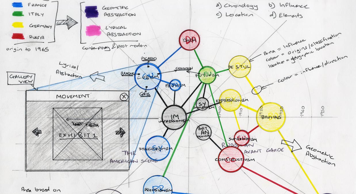
A hybrid layout evolved from the interpretations derived from the illustrations earlier. Geographically related movements grouped naturally based on the globe's equidistant azimuthal projection. This allowed for a chronologically compatible geographic distribution of the movements with the ability to clearly and accurately connect all the movements without any overlap.
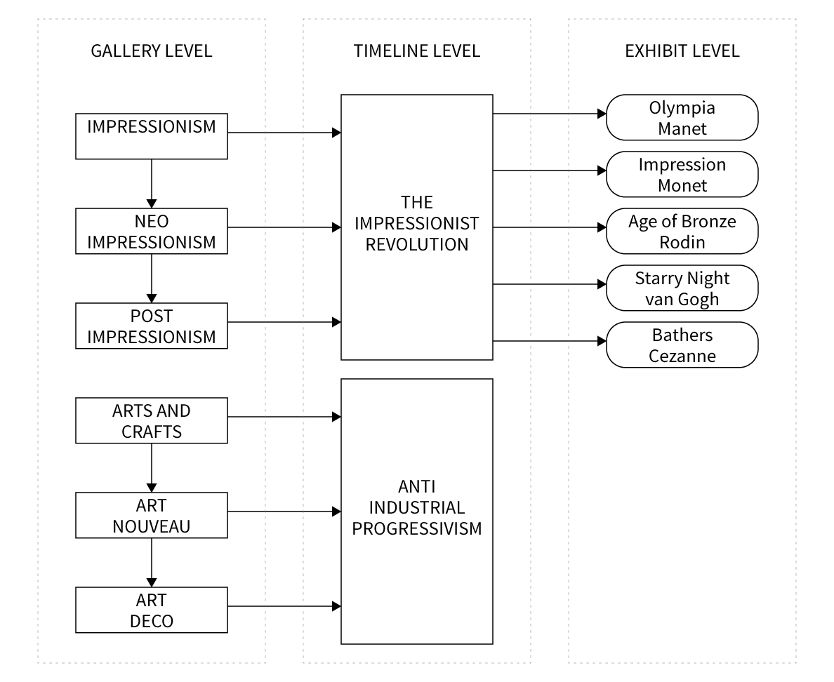
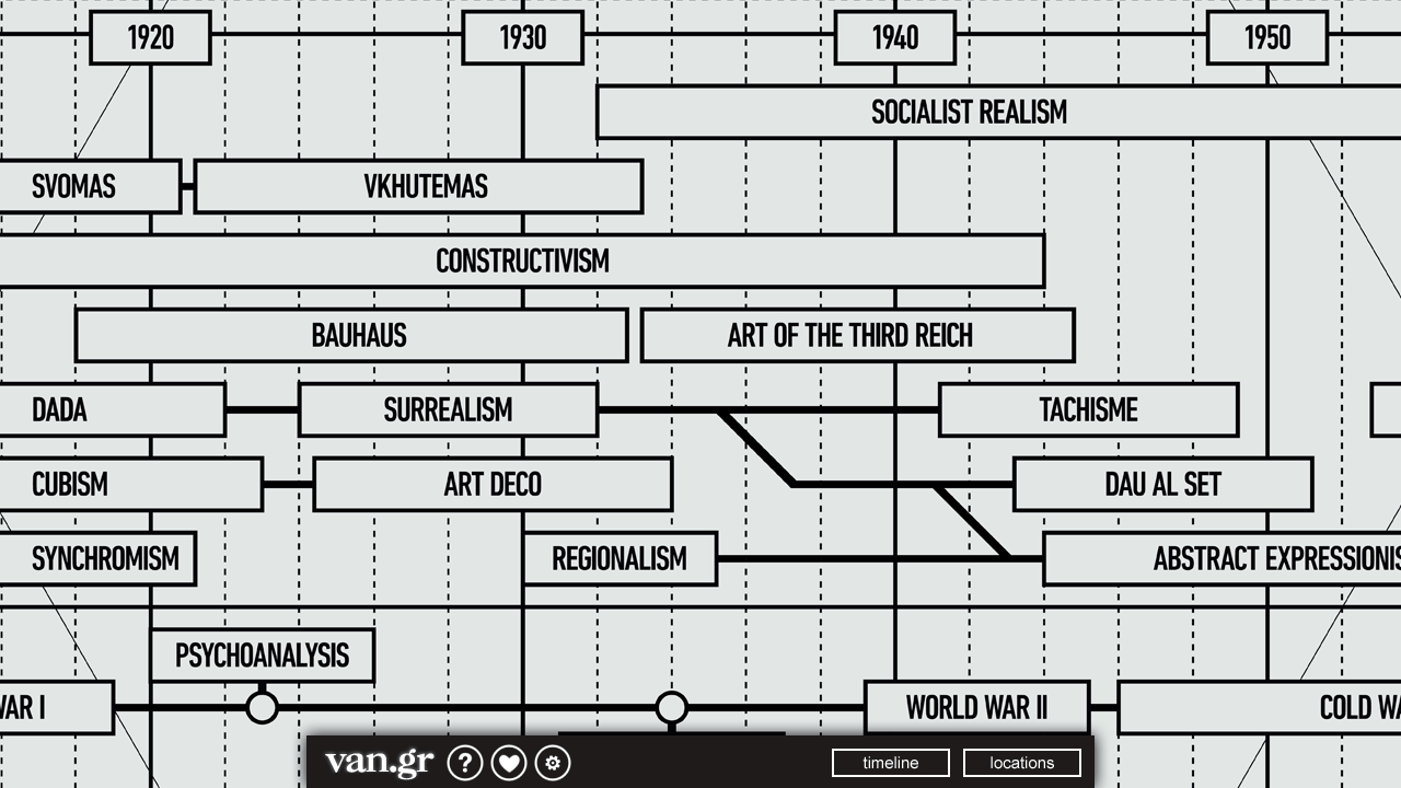
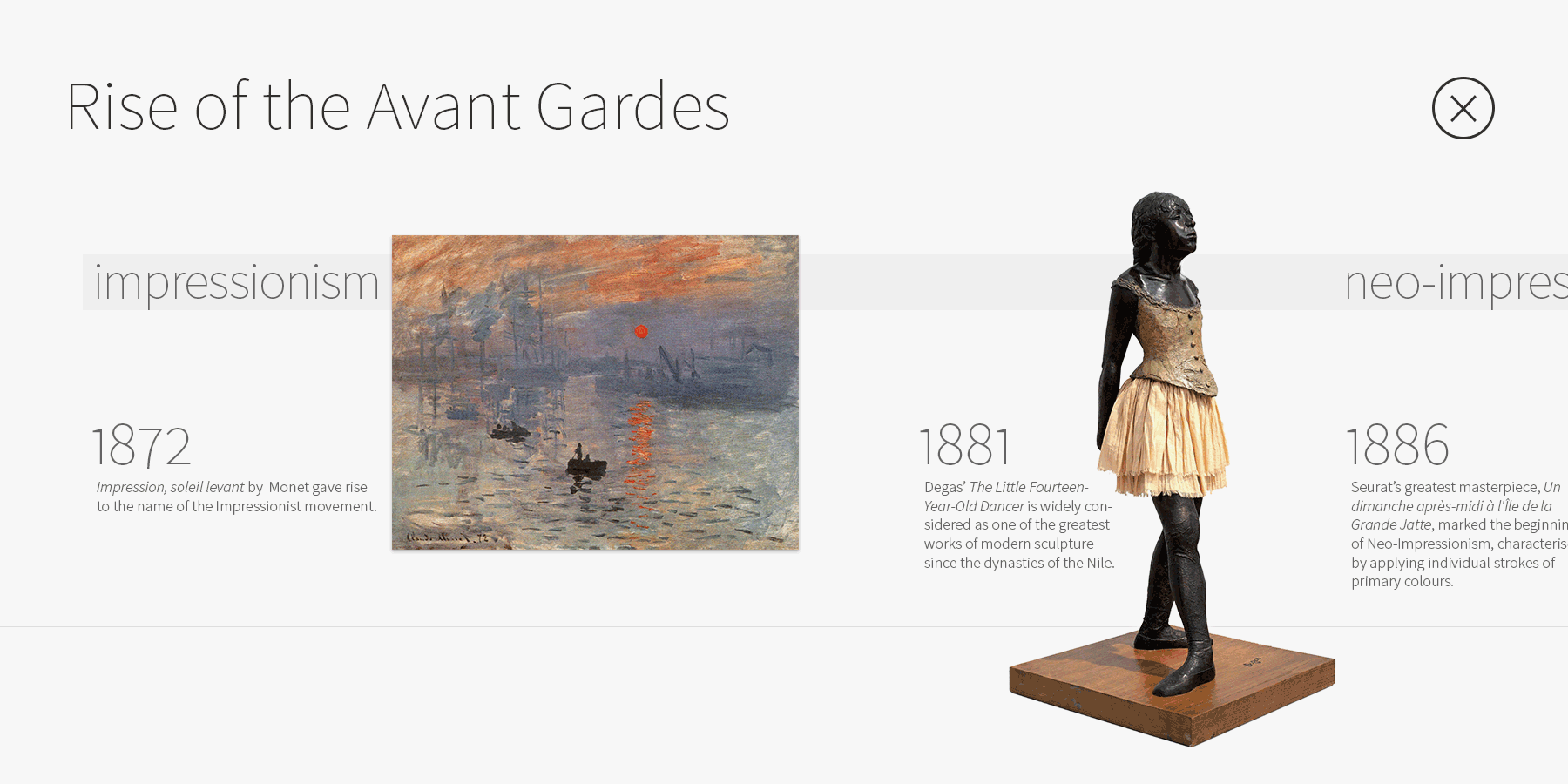
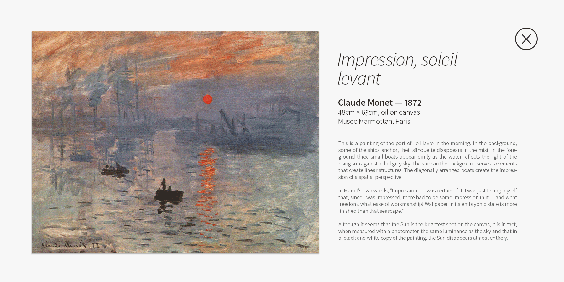
The illustration here show the timeline view that can be accessed for each individual movement. Each timeline spans over multiple interconnected movements featuring many paintings, sculptures, models and other exhibits. All exhibits scale proportionately with respect to one another. This makes it easier to interpret the true scale of the artwork as if one were in a museum.
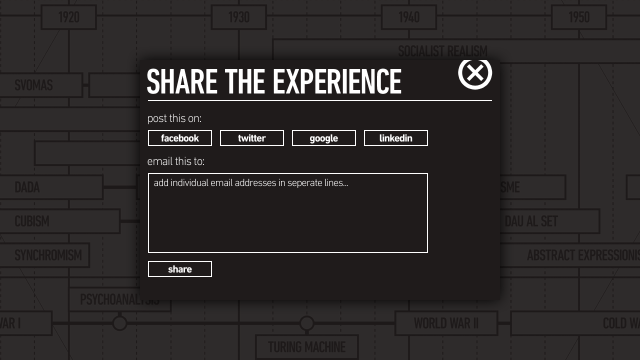
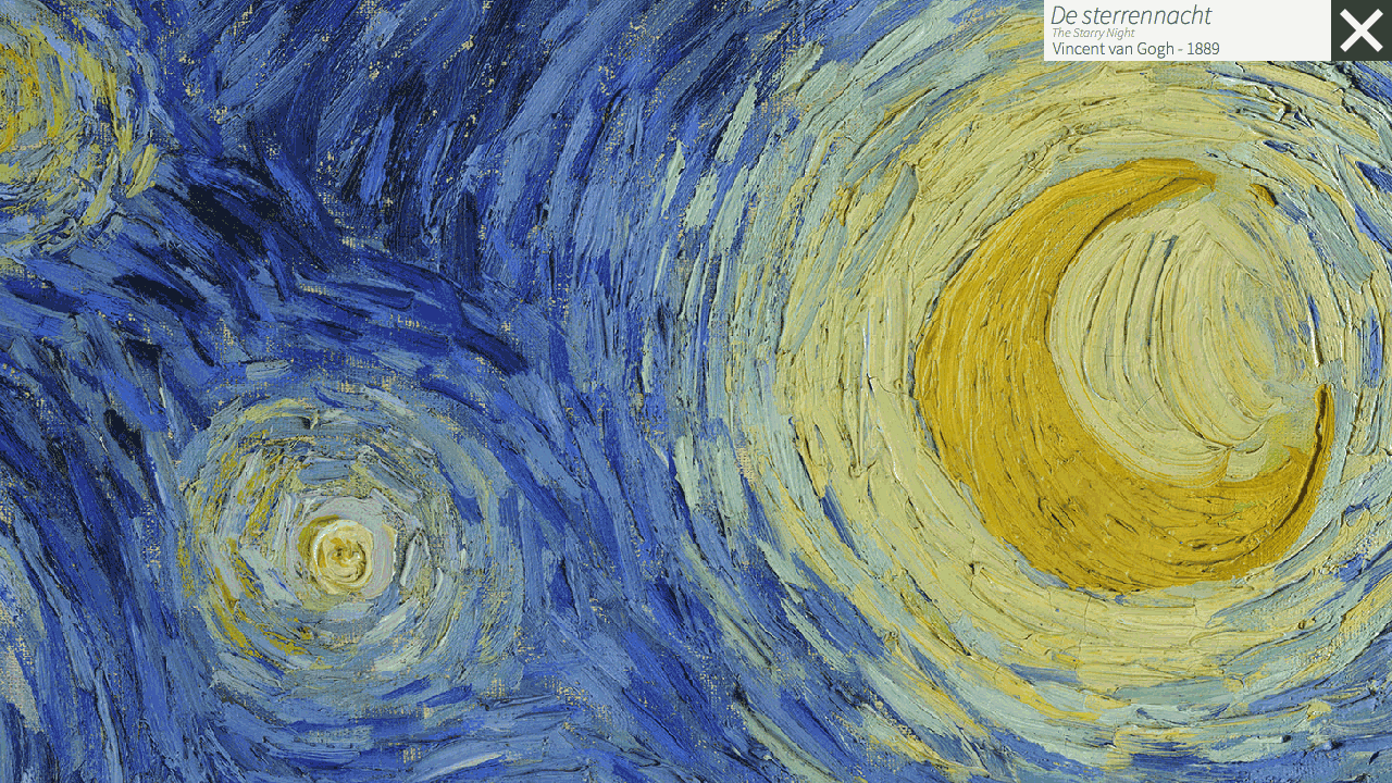
Each of the exhibits allows unique interaction opportunities. For example, paintings can be enlarged for a close-up view, scale models and sculptures can be viewed from a 360° perspective. This allows for a deeper level of engagement where more information on the exhibit is made available in the exhibit view for each of the exhibits hosted within the timeline.
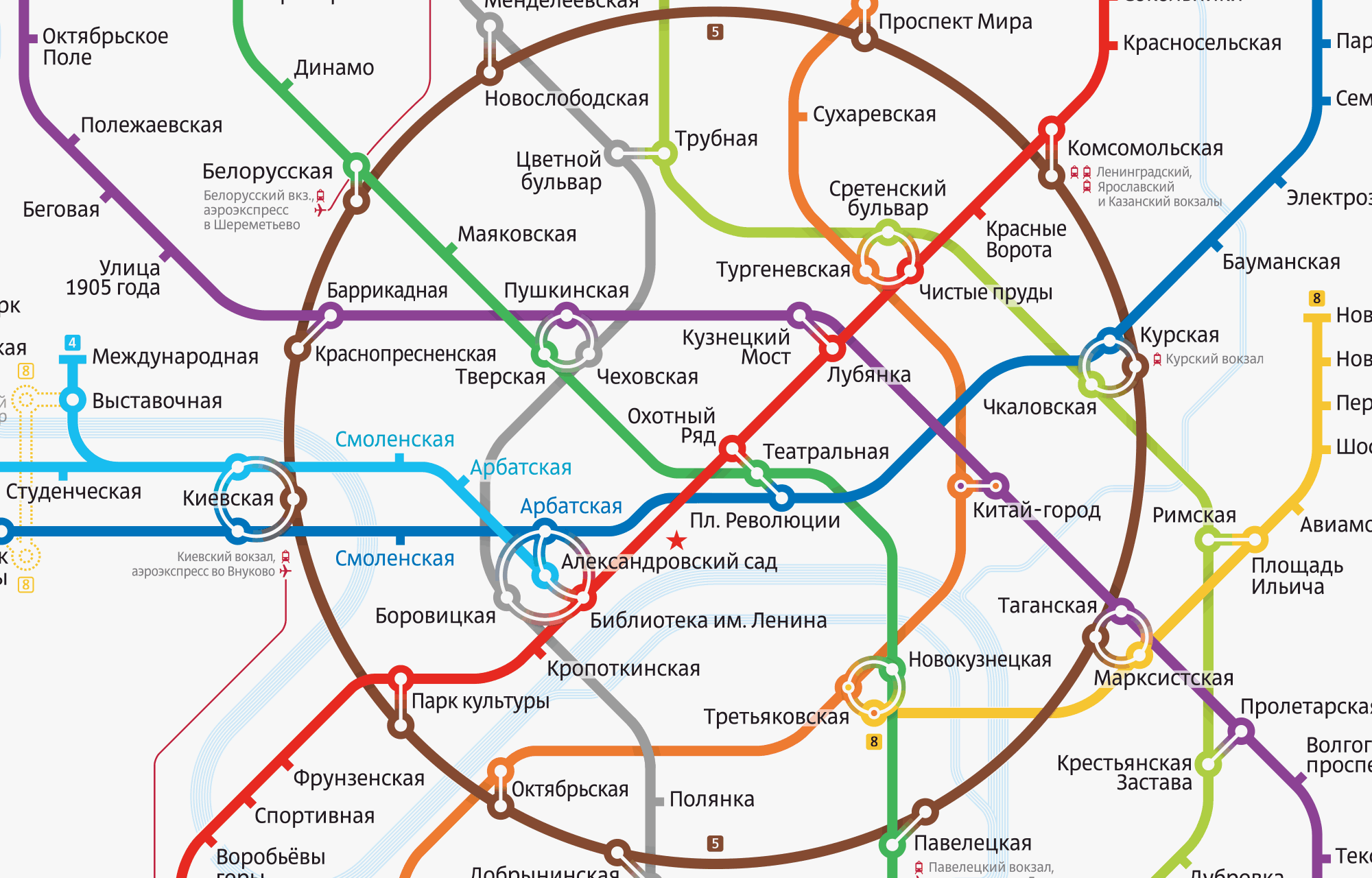
Sir Harry Beck mastered the art of communicating a complex system into a minimalistic diagram when he designed the London Underground map in 1931. Pushing geographic accuracy aside, he laid out underground routes using bevelled edges turning at clean and hard angles. London's transit map set the bar for succeeding maps around the world. It combines functionality with beauty and survives as an inspiration to designers today. A rail map that is easy to navigate makes exploring that city much more enjoyable. Over the years, transit maps have evolved from geographic representations to simplified diagrams. In effect, modern maps have been exponentially easier to navigate and much better looking.
This project takes inspiration from one of the most heavily used rapid transit system in the world, the Moskovsky Metropoliten. As of 2013, the Moscow Metro has 188 stations and its route length is over 313 kilometres. The circular line in the illustration pops out immediately, drawing your eyes to the centre of the city. The weights of the circles for each station are thicker than the lines, helping give more white space to the map.
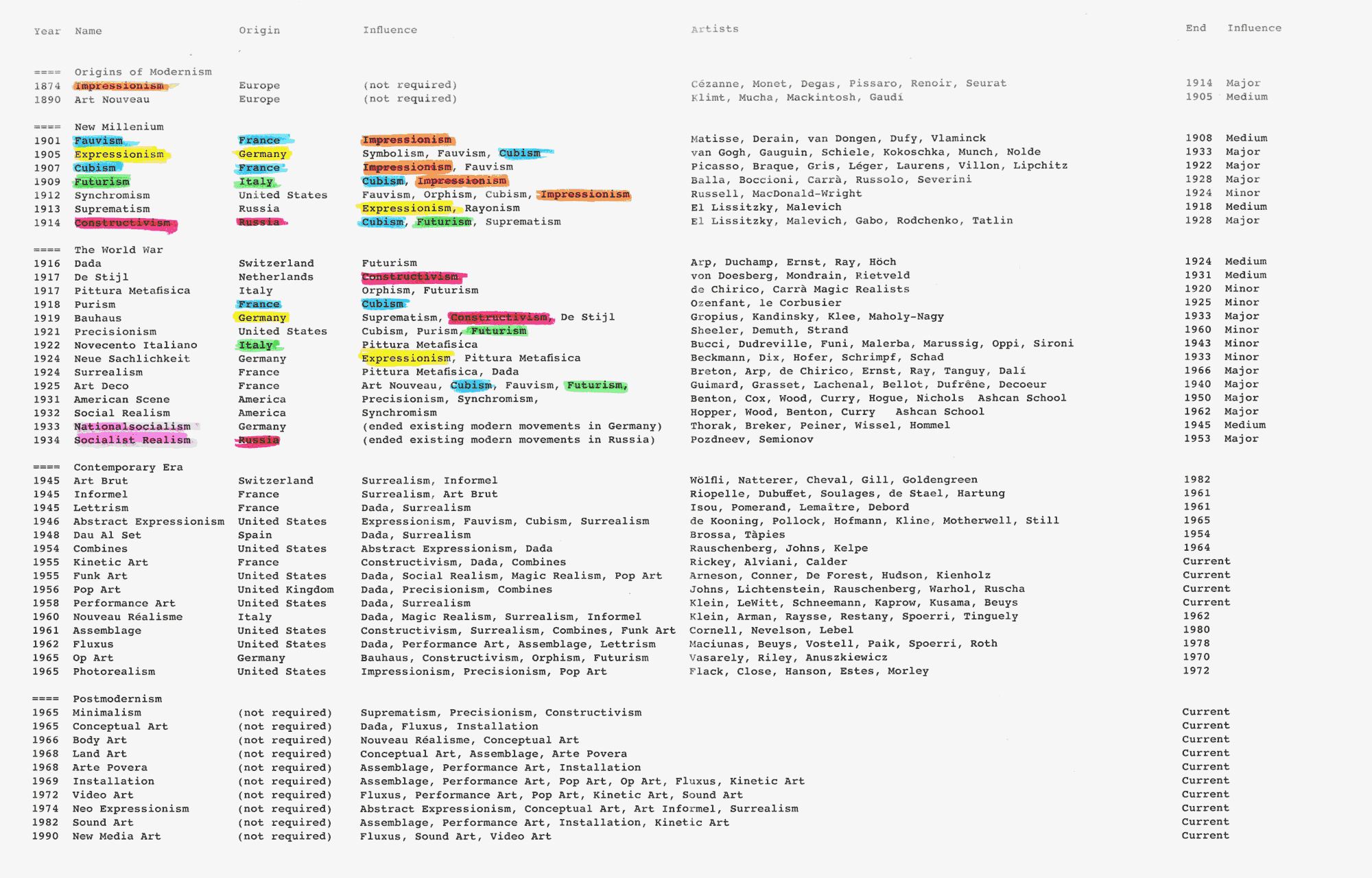
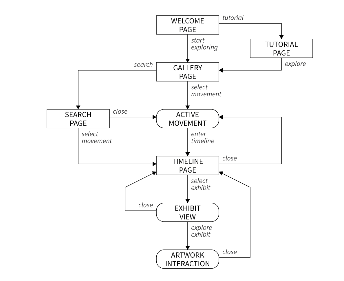
The first steps involved building an accurate and comprehensive database of influences between the art movements and finally to find the method of visually conveying them in a graphical way. This gave birth to the gallery view where all the art movements' timelines were accessible. The timeline evolved from a feature complimentary to the gallery in to an interactive experience where artworks could be presented in ways different than books and museums.
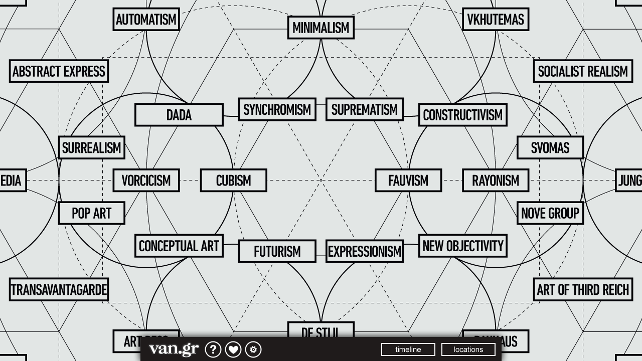
Similar to the Moscow Metro, the abstract gallery for the project faces similar challenges, displaying colossal amounts of multifaceted data within a single interactive infographic. Balanced visual elements make it easier for the user to see patterns clearly and be able to interact with the graphic using a touch-based method of interaction. Graphic elements are kept to the bare minimum with typography playing an essential role to highlight key elements of the chart, in the case of this project, the art movements. This design clearly takes inspiration from the London Underground described earlier.
The introduction page allows users to enter the gallery or view a tutorial. Users then proceed to the gallery where they can explore interconnected art movements in a chronological and a geographic layout. Each of these movements connects to specific timelines where all the exhibits may be viewed and interacted with. All timelines emerge from the gallery and lead to either other regions in the gallery or to exhibits contained in the timeline. The exhibit is an artwork in an isolation mode where unique interactions are possible. All exhibits exit back to the timeline, which in turn exits back to the gallery.
The first visual designs were constructed for the clickthrough prototypes. The illustrations below show the early implementations of the gallery and timeline. Limited in scope and functionality, this was a bare-bones approach to convey the spirit of the project in an attempt to gather interesting ideas from people to whom the prototype had been presented to.
Typographic principles played an important role in developing the grid system which served as the armature on which images, graphics and copy could be laid out. As shown in the visual design, all visual elements were reduced to typography and basic shapes for the user interface. Inspired by the aesthetics of a modern art gallery, the use of colour had been reserved for exhibits so they commandeer the user's attention followed by the typography if users wished to read the copy.
Additional typographic principles such as ascender, descender and cap heights were important aspects of creating the grid and determining the layout and margins for each of the modules. All type variations are reduced to three levels of shading, three point sizes and three font styles. Where relevant, the type was bolder for keywords, emphasis and italicised for titles or foreign words. Finally, the density of text was kept to the minimum with abundant white spaces around text and exhibits.
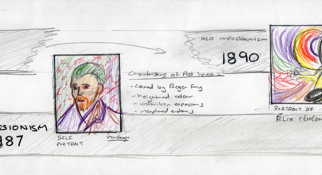
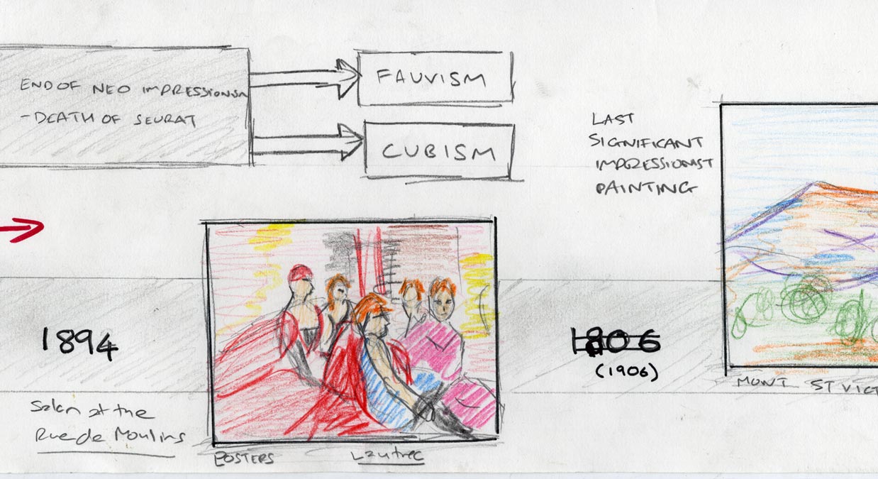
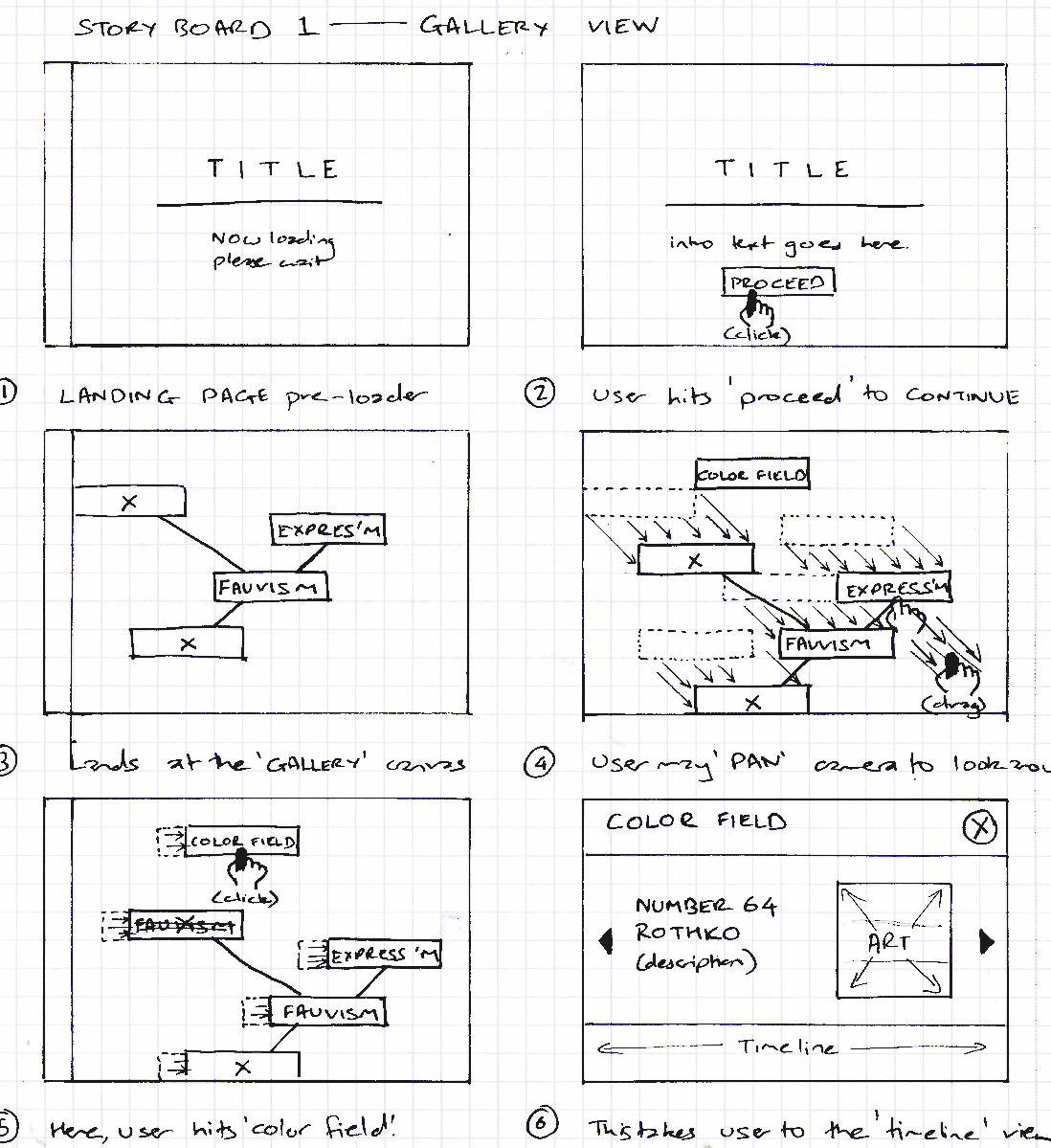
This gallery-timeline-exhibit experience evolved as a result of early paper-prototyping, which was derived from a series of storyboards. Shown here is one such set of storyboards developed to establish the experience the projects was set to deliver.
1: Gallery view
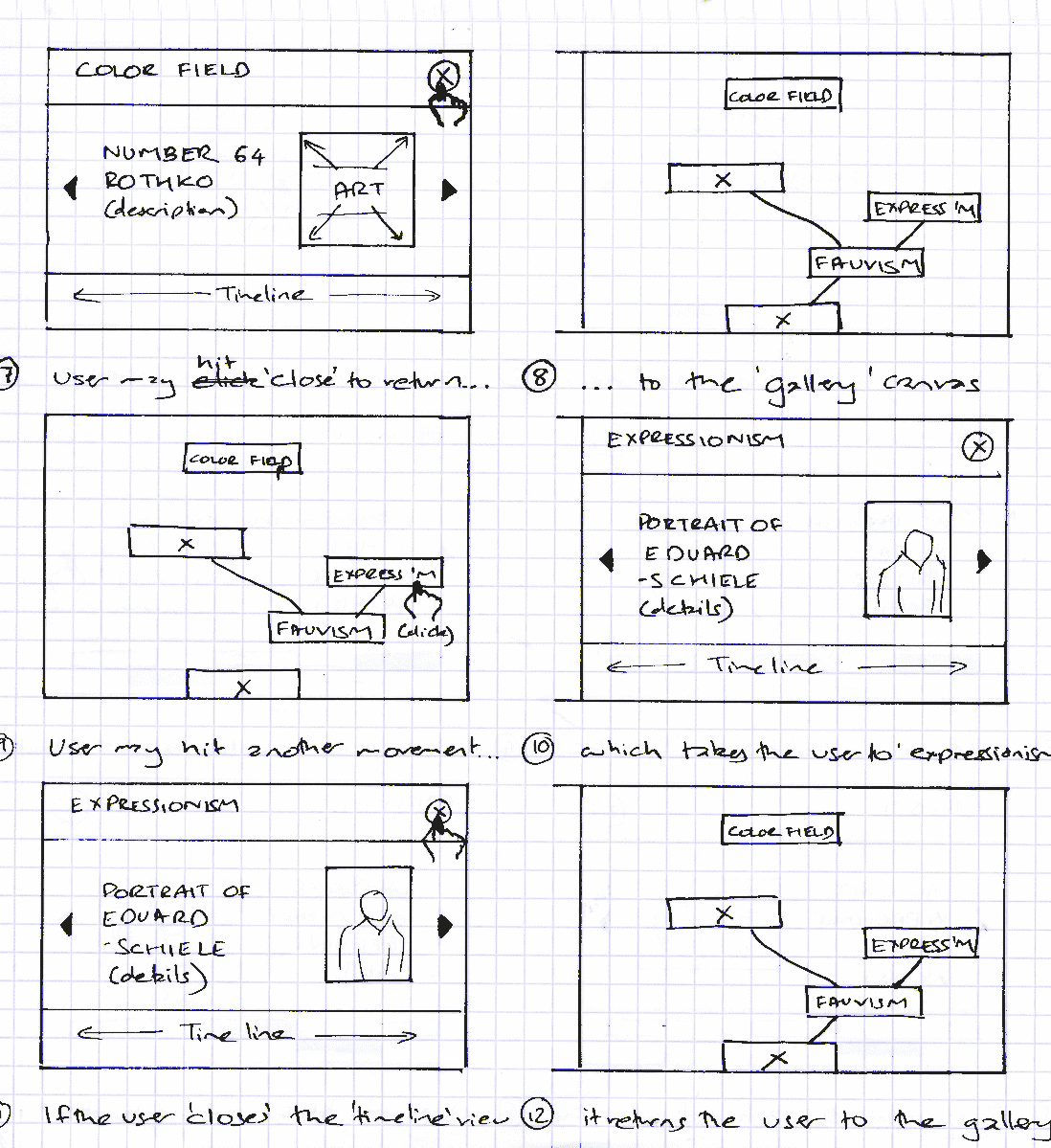
The storyboard above shows the experience of a first time user. On entering the gallery, the user pans the canvas and finally chooses the art movement called 'Color Field' and enters the timeline. After viewing, the user exits and returns to the gallery and proceeds to choose 'Expressionism' and after viewing the timeline, returns to the gallery view.
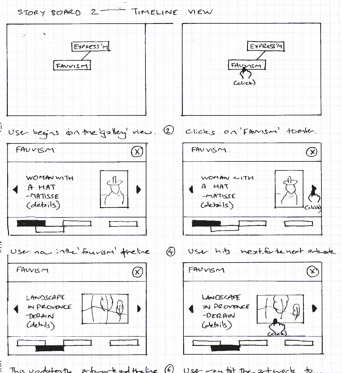
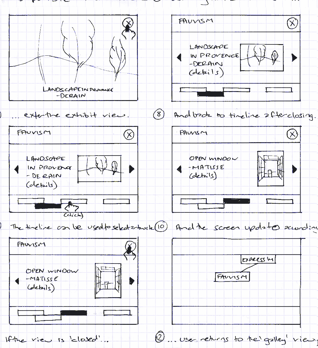
2: Timeline view
The next shoryboard shows a user entering the timeline for 'Fauvism' and browsing through various artworks. On interacting with the artwork 'Landscape in Provence', the user enters the exhibit mode where the artwork can be viewed in better detail. The, the user returns to the timeline and views other artworks, finally returning to the gallery view.
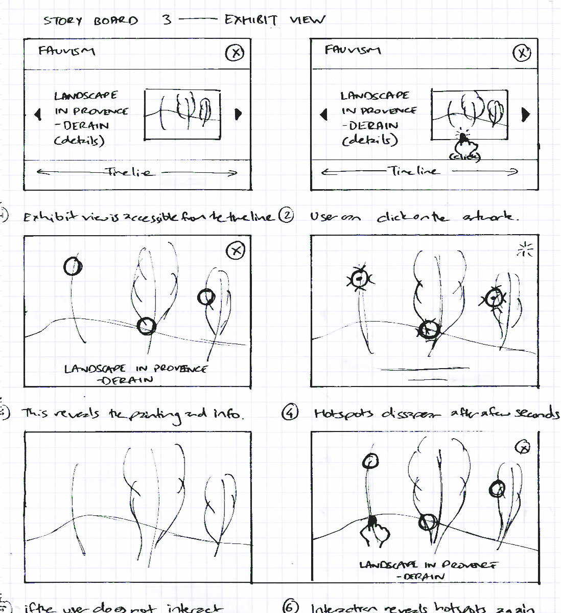
3: Exhibit view
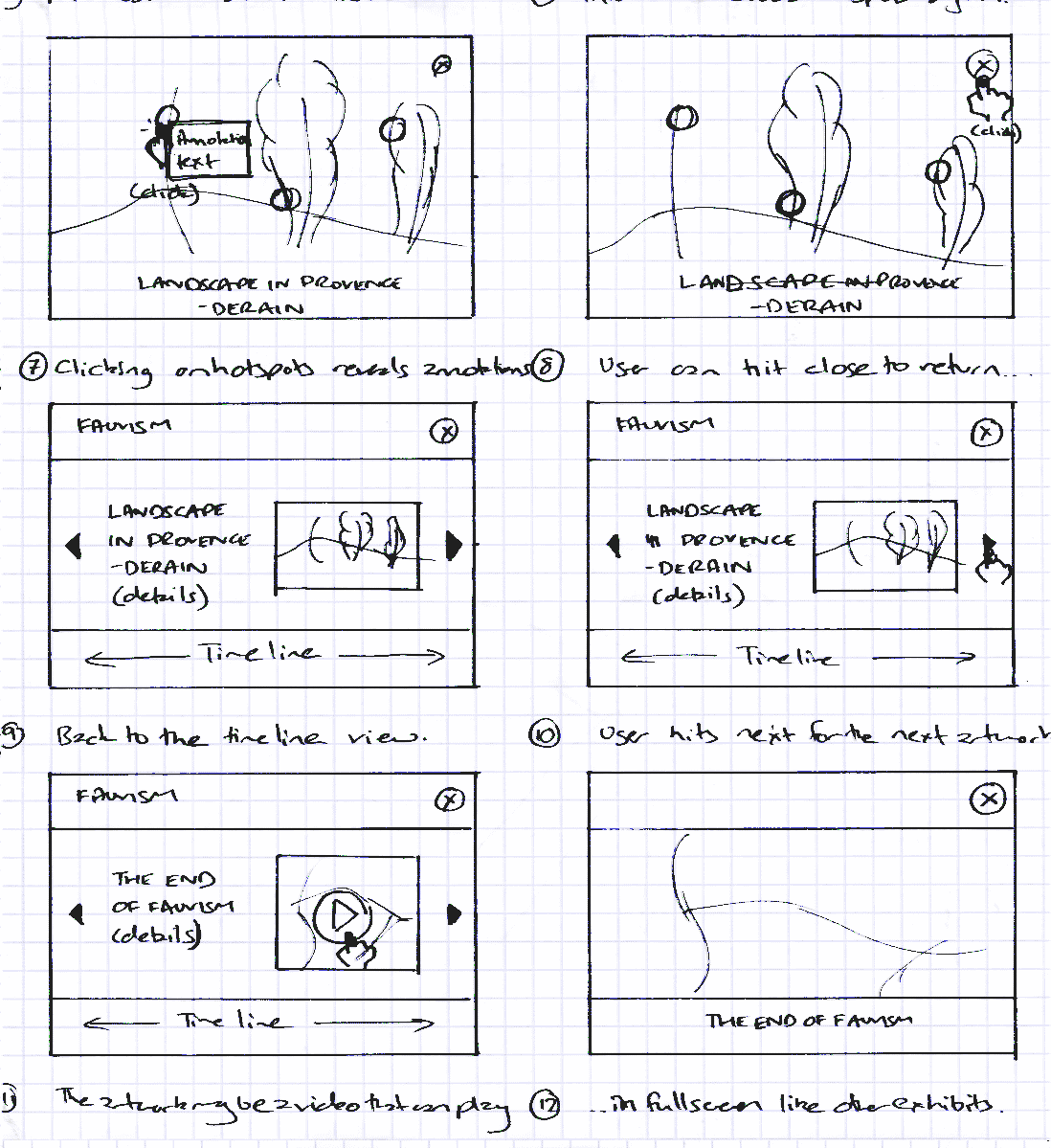
The final storyboard shows the user entering the exhibit mode for 'Landscape in Provence' and interacts with the painting using interactive image hot-spots. Each of these hot-spots present more details on the specific characteristics of the painting's attributes. Upon returning to the timeline, the user then interacts with a video module for 'Fauvism'.
This gallery of screenshots is a walk-through of each of the component of the project shown in the teaser video above and captures the gallery, the timeline and the exhibit view's intended experience. Lastly, it shows how the final product has evolved over many design iterations from idea development, storyboards and visual designs to finally and fully experience the rise of the avant-garde.
1: Explore
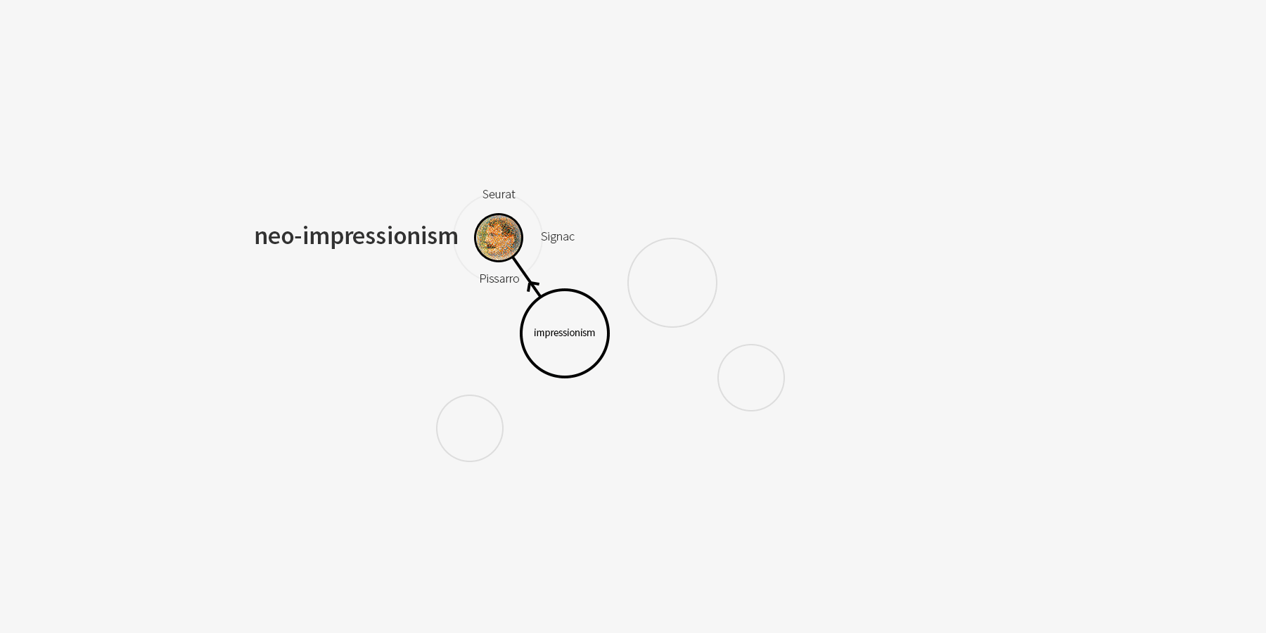
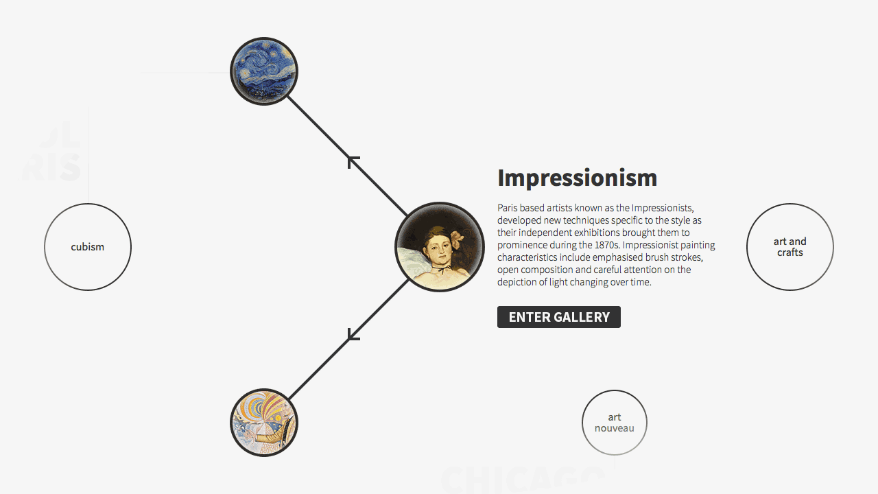
User begin with a canvas where interactive nodes representing art movements are laid out based on chronology and their geographic locations. Interacting with these nodes show their association with related art movements.
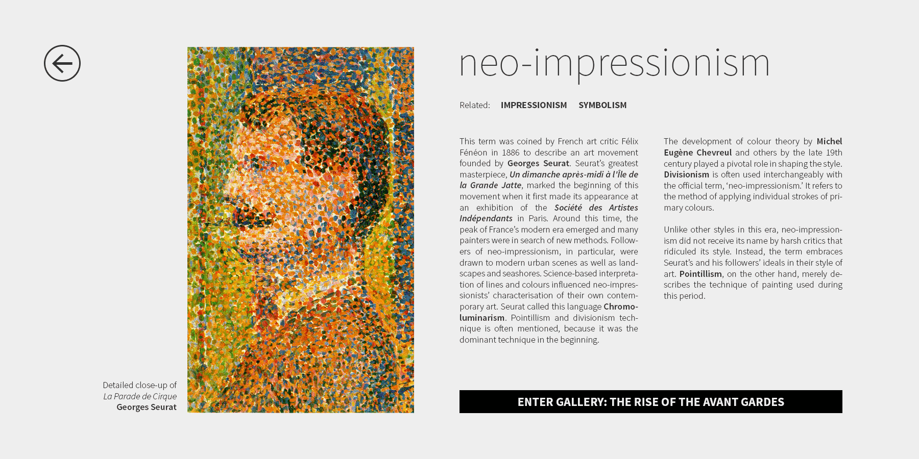
2: Introduction
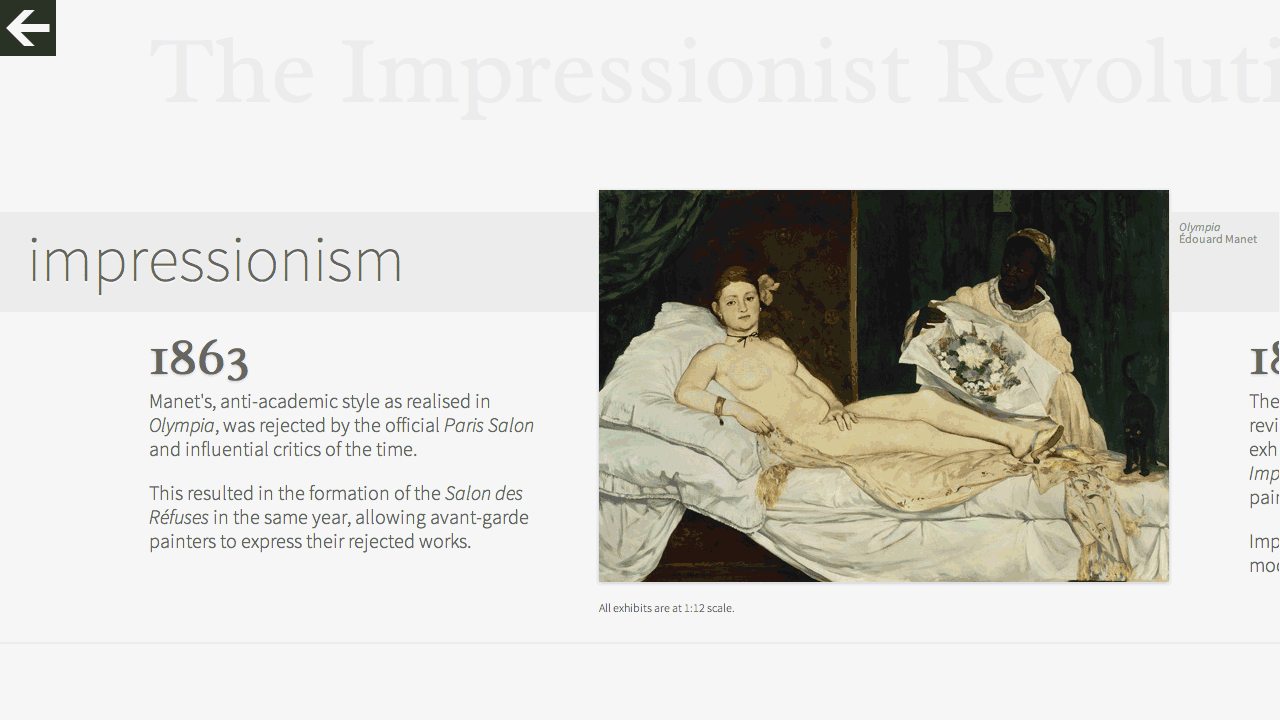
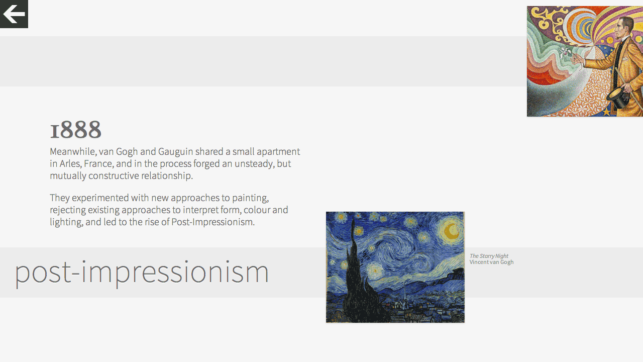
All nodes connect to a timeline that narrates the history, rise and impact of the selected style and the work of the leading figures. Also, the movements unique characteristics and historical milestones are described in detail.
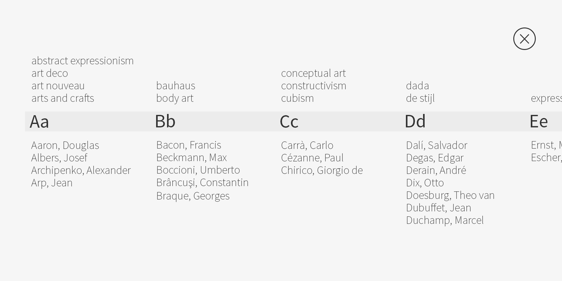
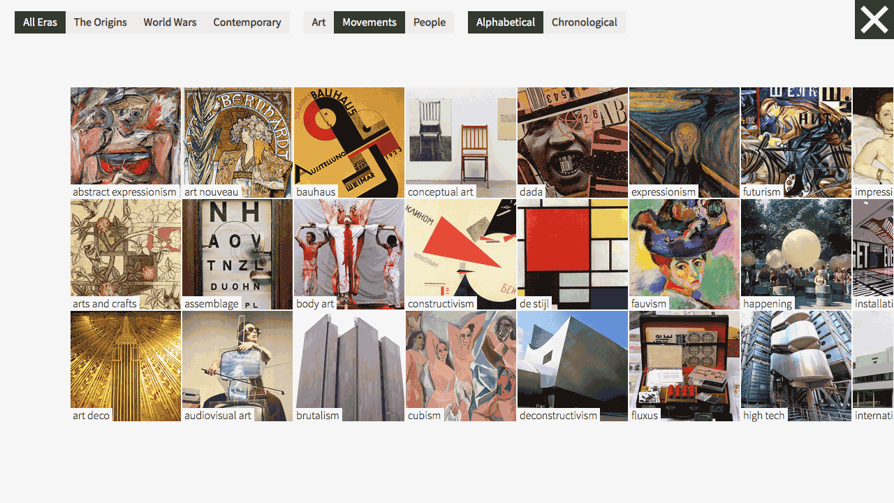
3: Search
Alternatively, users may search for specific art movements or artists. This is particularly useful to users who know precisely which artist or movement they are looking for as opposed to exploring modern art chronologically.
4: Timelines
Timelines span over multiple art movements featuring paintings, sculptures and models that scale proportionately with respect to each other. Users can quickly browse interconnected movements within overlapping timelines.
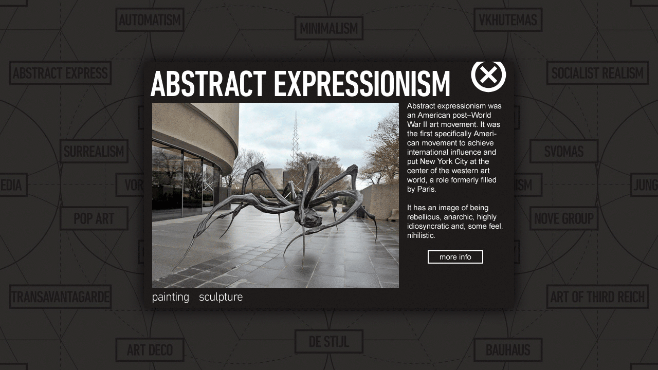
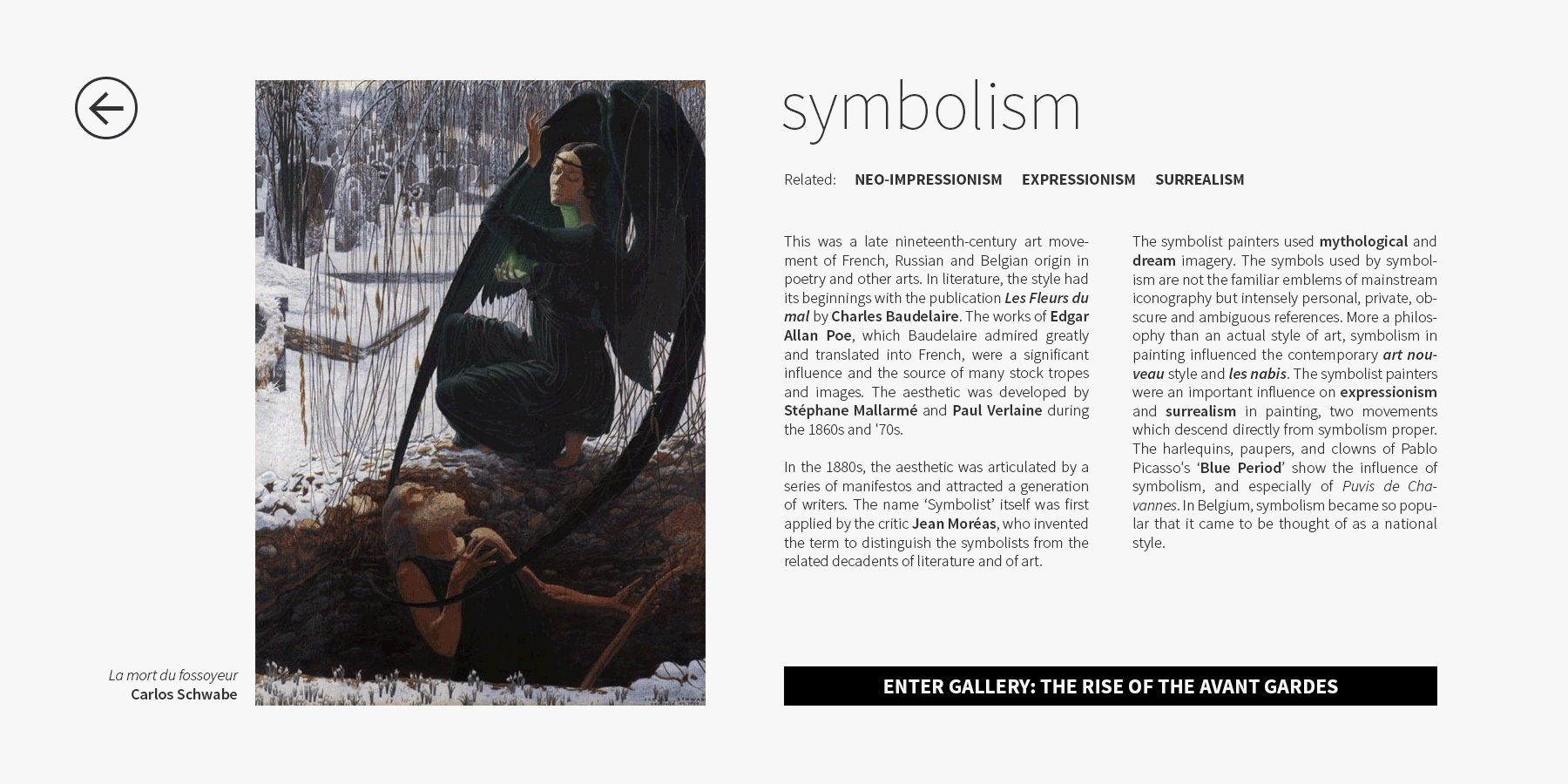
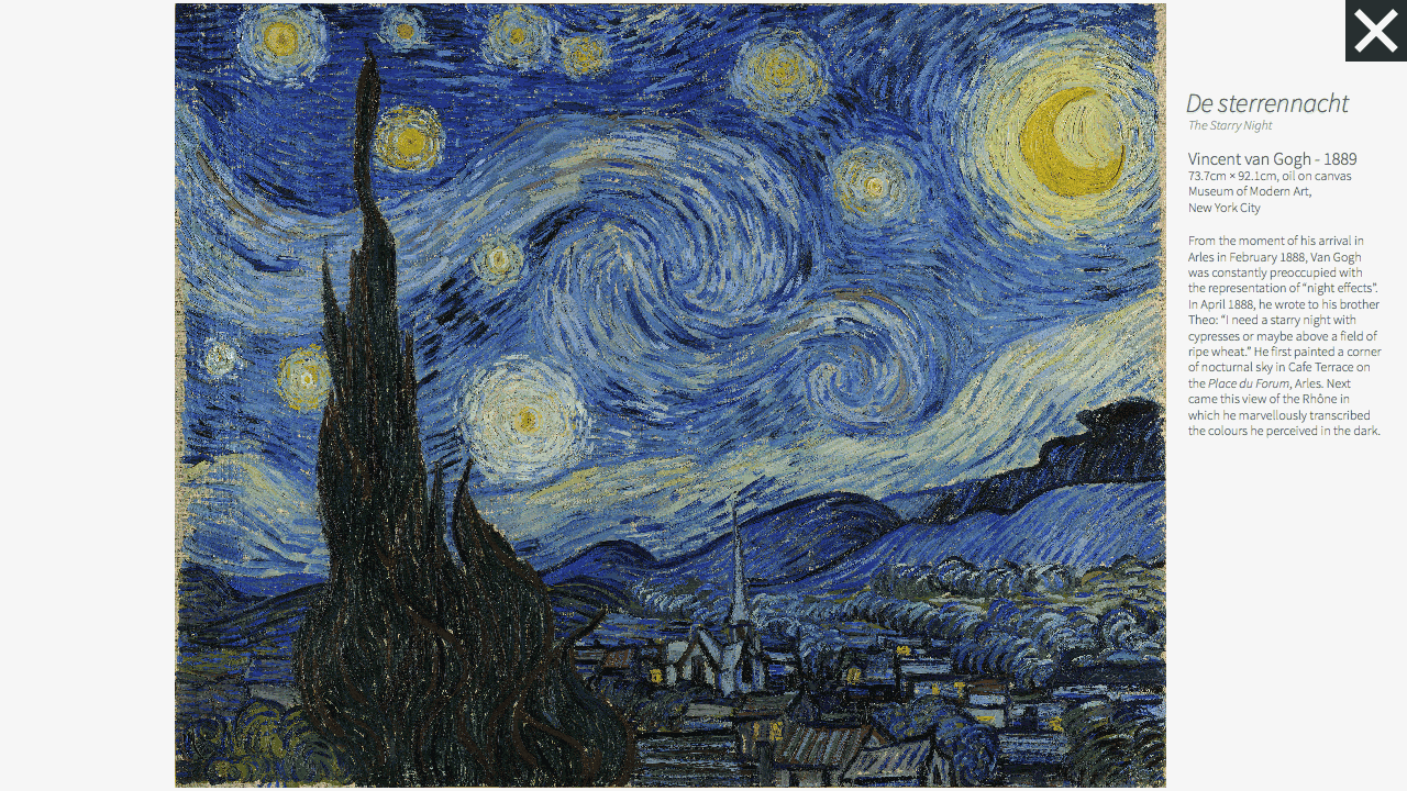
5: Exhibit
Artwork can be viewed in isolation in the exhibit viewing mode where details are available on the adjacent placard such as the name of the exhibit, artist, year of creation and where the exhibit is on display.
6: Inspection
Each of the artworks allows unique interaction opportunities in the exhibit view. Users can enlarge paintings for a closer look. Scale models and sculptures, on the other hand, allow a 360° perspective view.