
Portfolio of projects undertaken at the Academy of Art University.
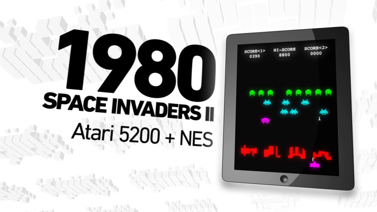
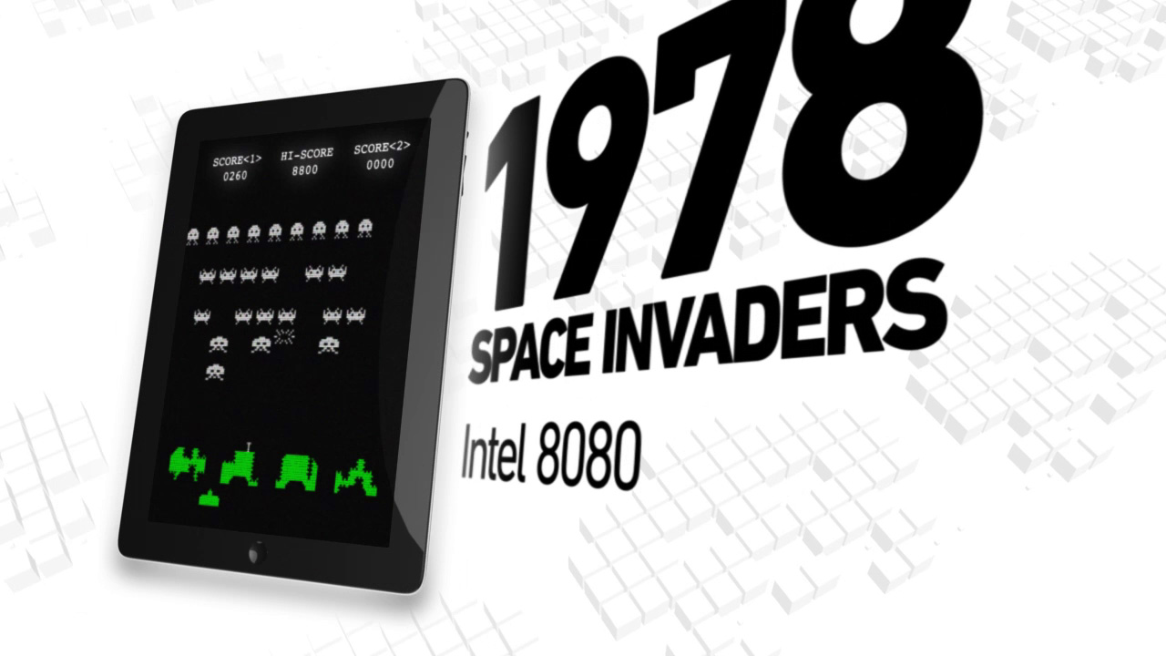
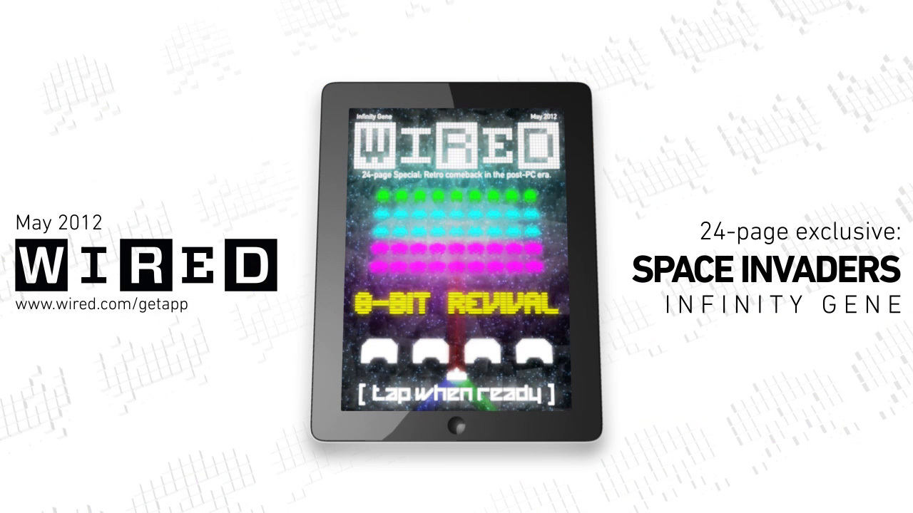
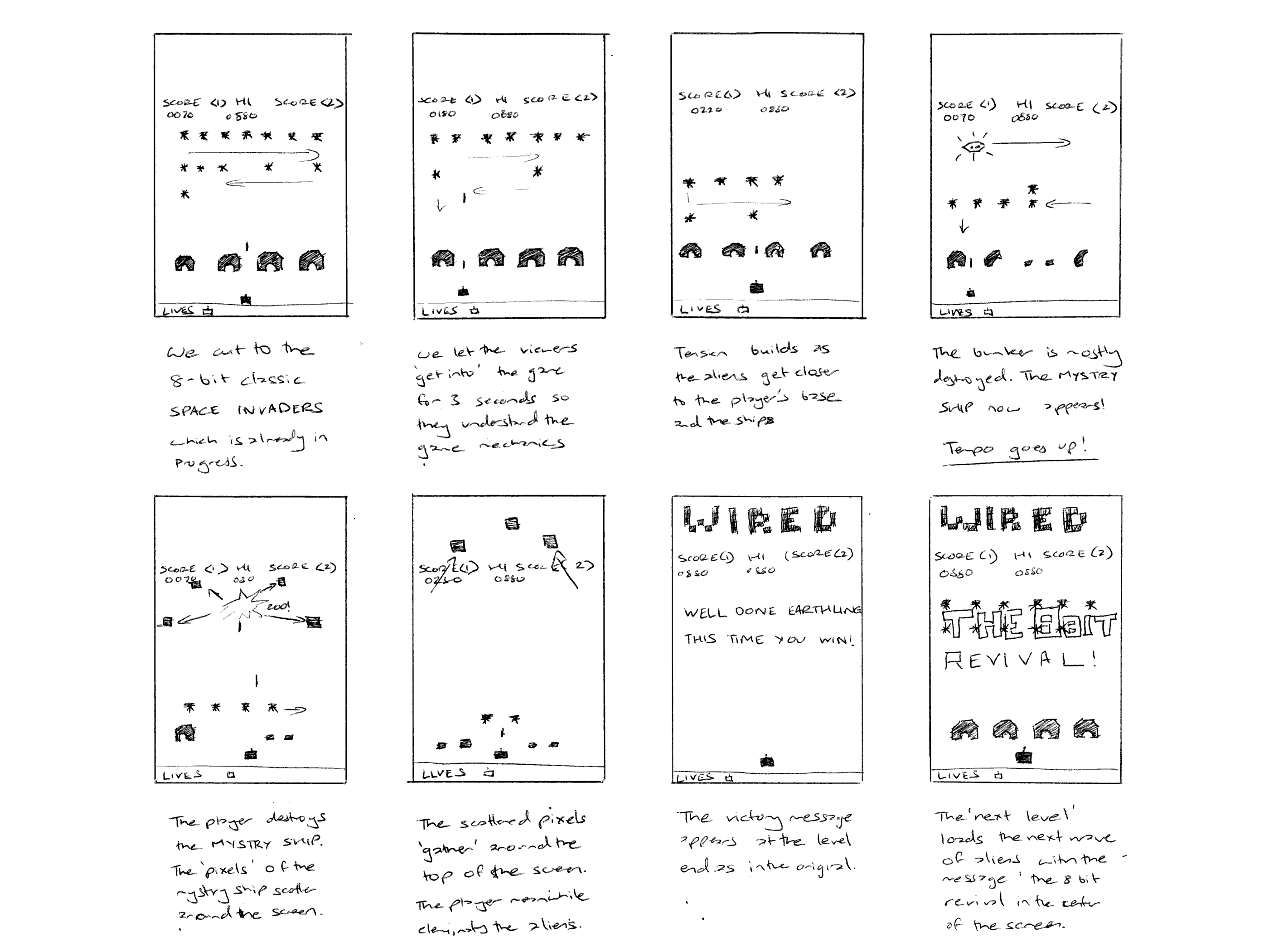
Motion Graphics for the Wired Magazine's 'The 8-bit Revival' iPad subscription issue. Created using Autodesk Maya for modelling, animation and Adobe After Effects for compositing.
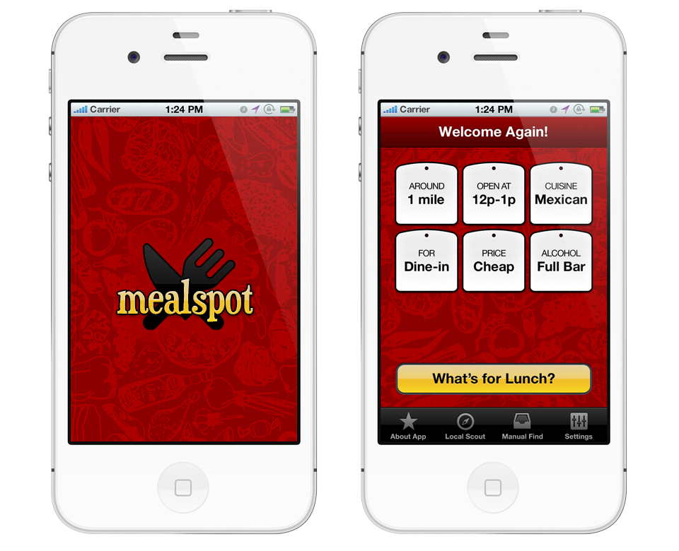
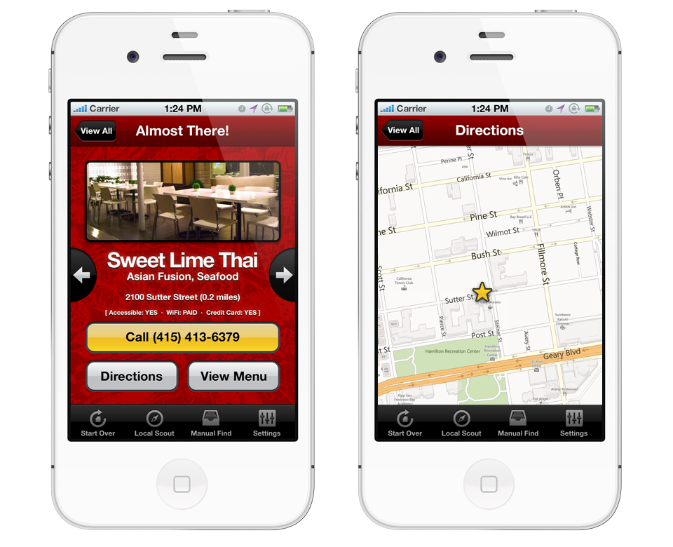
Mealspot is a mobile application developed for Unilever that allows users to find nearby restaurants, browse the menu, call their business phone, check delivery options, make reservations and get directions to the restaurant. Over time, the application would learn the user's behaviour and recommend restaurants based on their preference patterns.
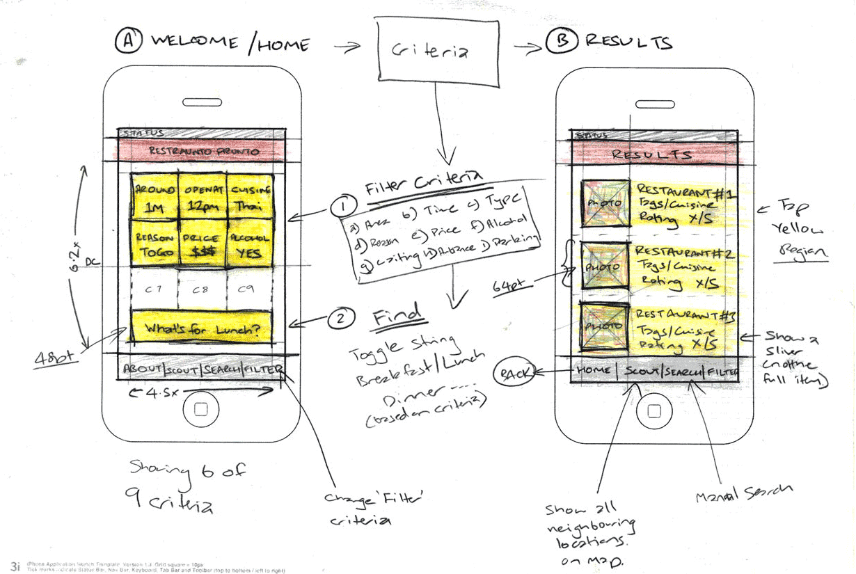
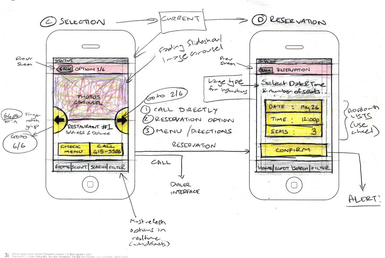
The primary objectives of the application's design are speed, machine learning and ease of use. Shown below are initial concept sketches outlining the optimal flow while considering all the requirements provided. The user flow diagram shows a complete schematic of the application such as search results various filtering options, search criteria, suggested actions upon selecting a restaurant and various third party APIs integrated into the application.
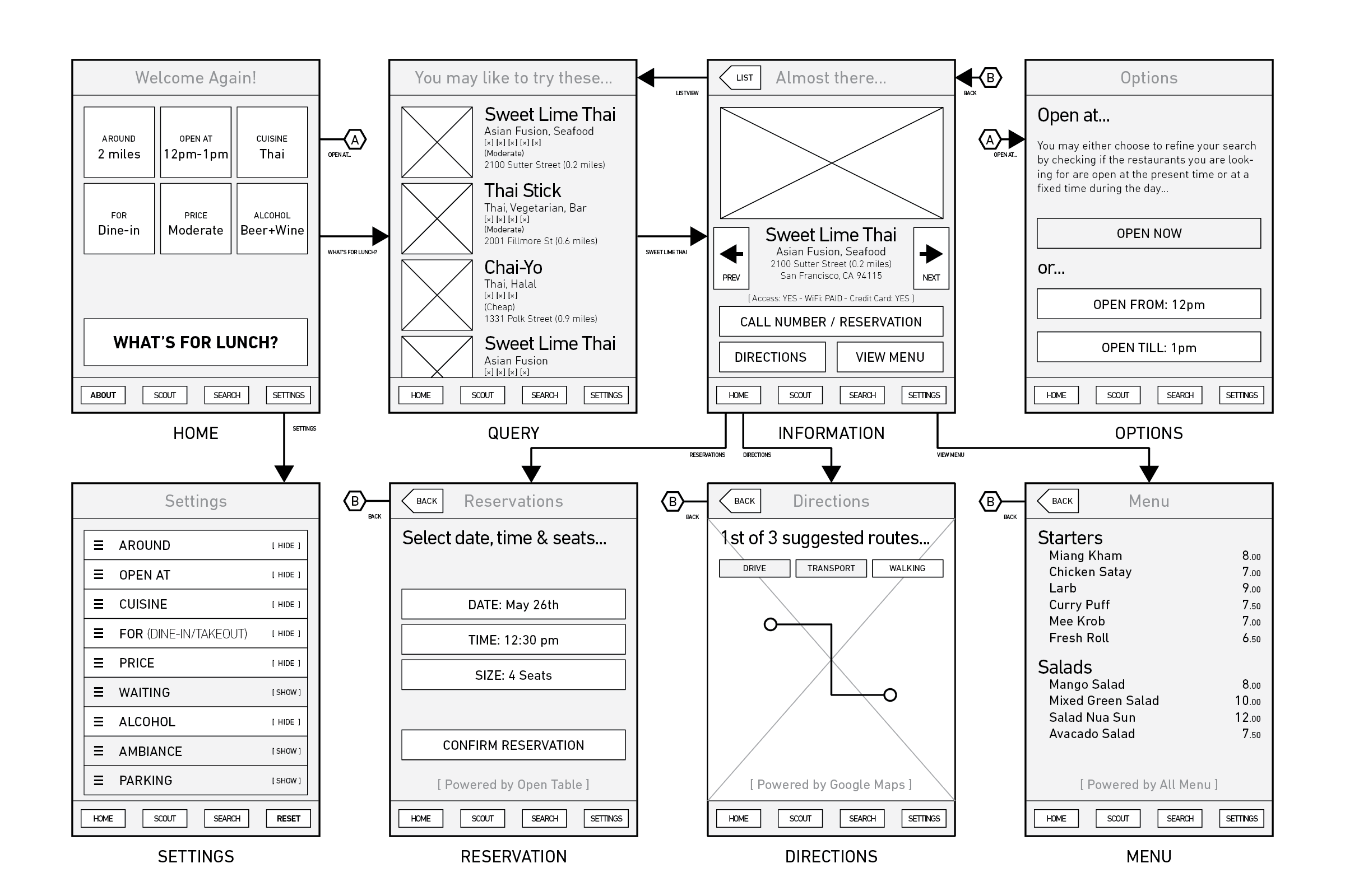
The colour scheme was inspired by Pantone's colour books. A combination of red—exciting, energising and hot and yellow—friendly, stimulating and lively; complemented the application's theme very well.
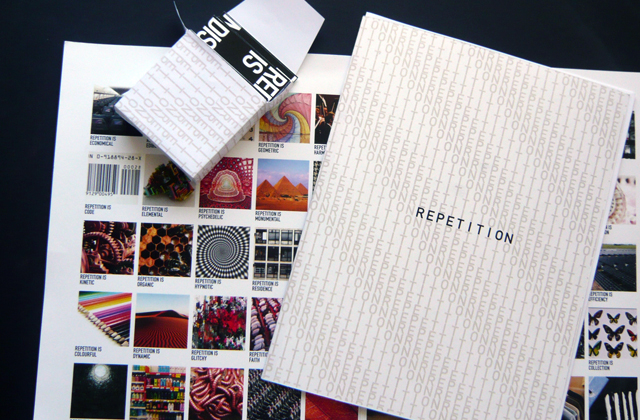
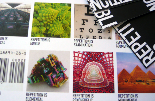
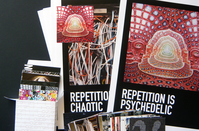
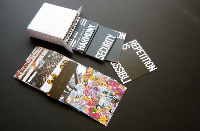
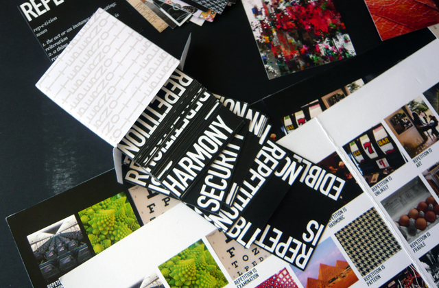
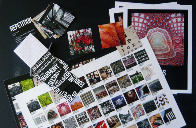
Graphic design assignment for a class in 'Making Ideas Visible' to show fifty ways of showing repetition. Photographs below are the journals, coasters and slides that were used to present on the subject.
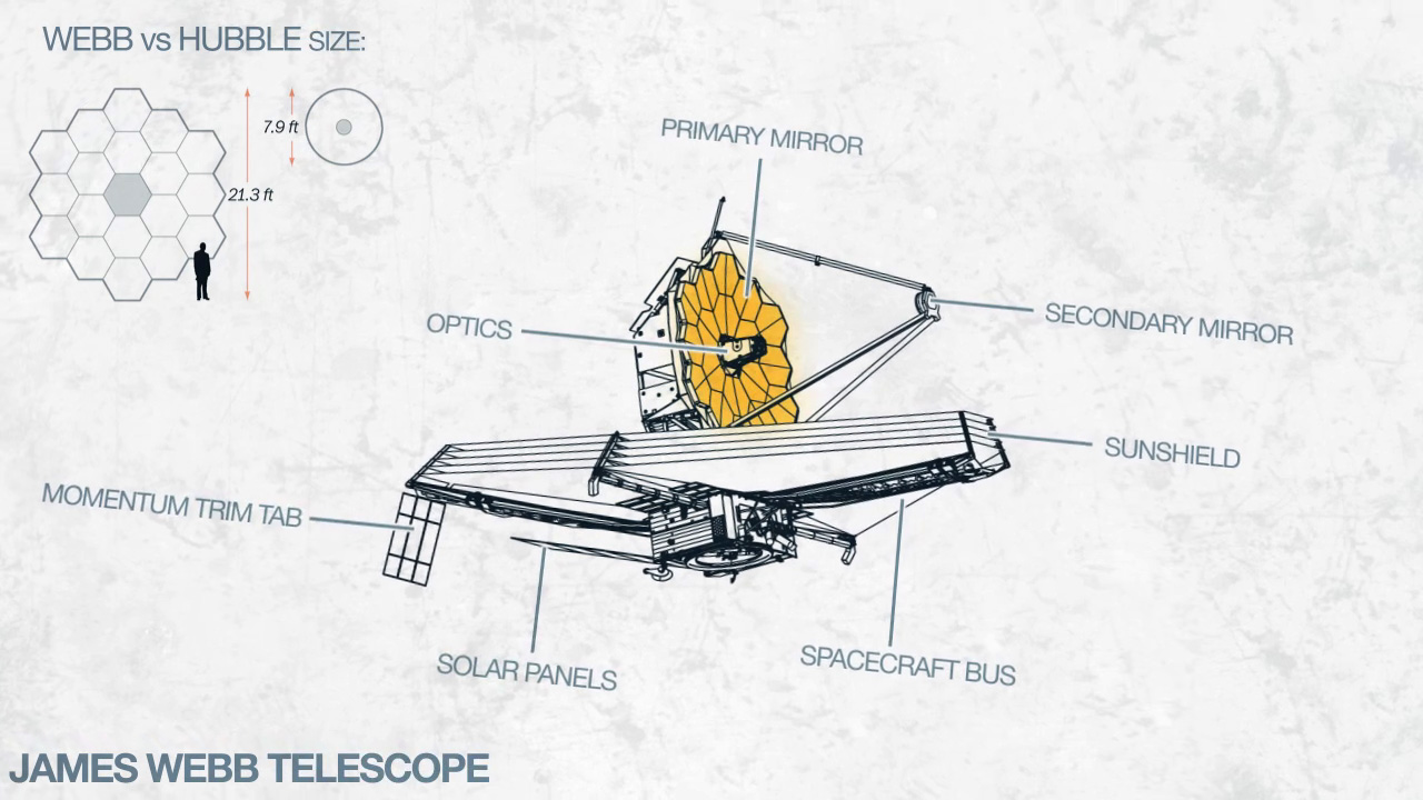
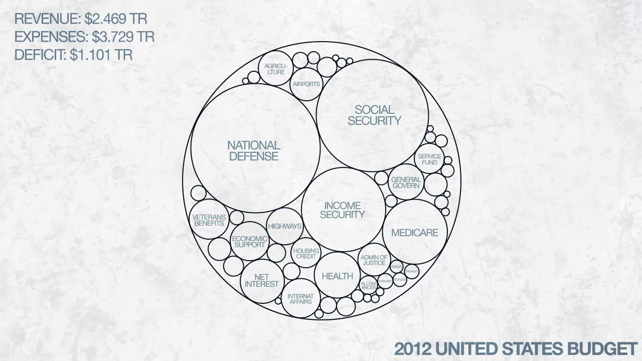
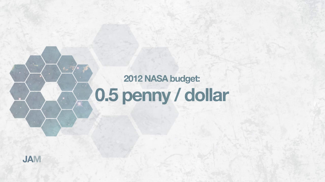
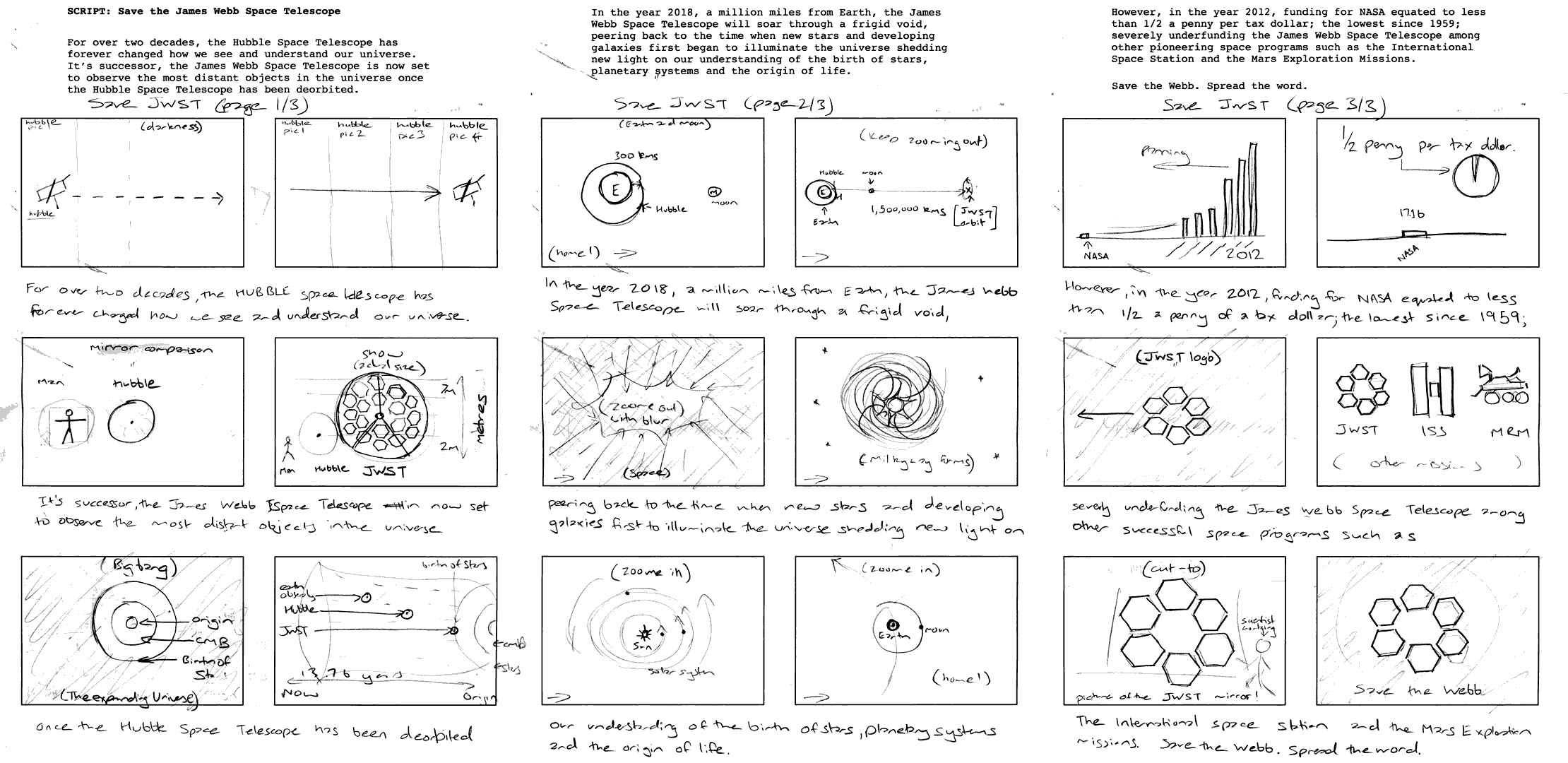
Entry for the 'The whyJWST Video Competition' in a community effort to raise public awareness for the James Webb Space Telescope. Created using After Effects for animation and compositing.

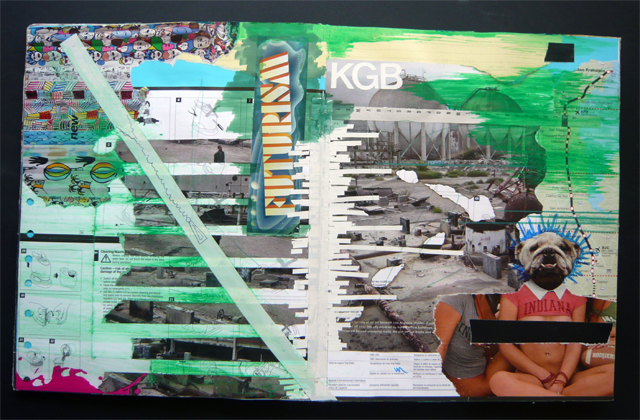
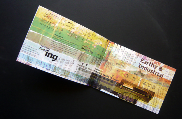
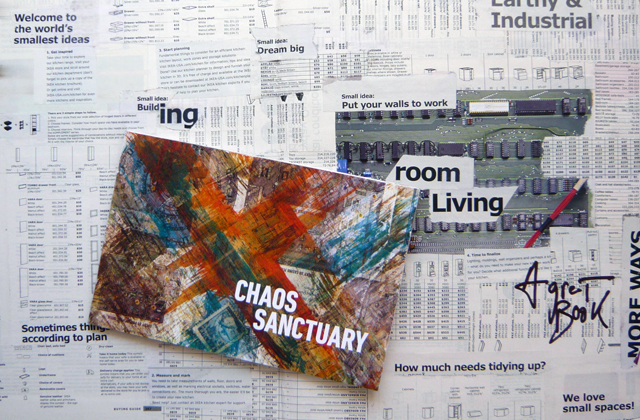
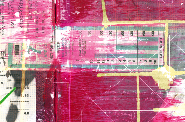
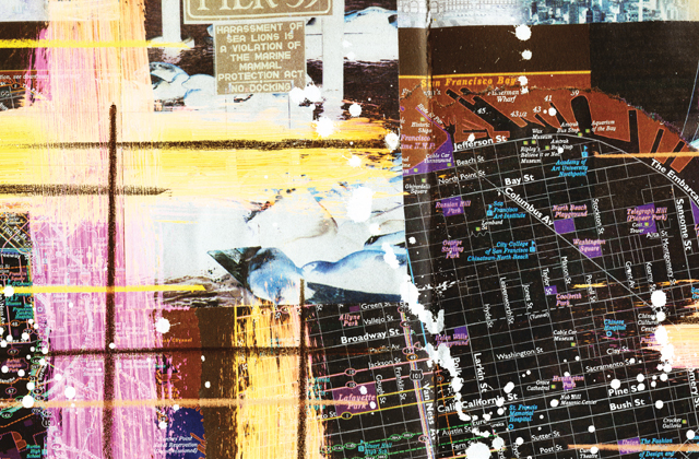
Bookmaking assignment for a class in graphic design at the Academy of Art University. The artwork for the smaller book was scanned from a workbook with over forty collages assembled from found objects.
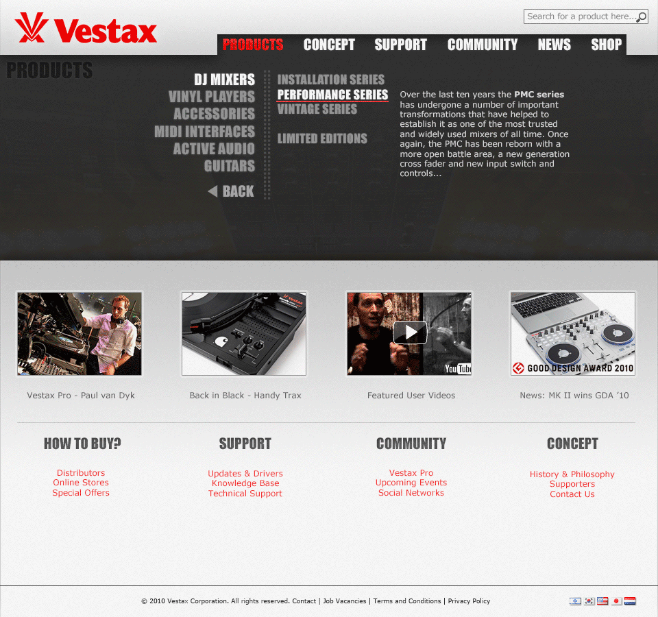
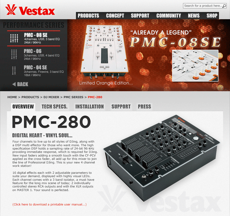
Vestax Corporation undertook the transformation of its global web experience to a responsive and unified experience for the Japanese, American and European markets in an attempt to reboot their web presence and online identity. Vestax is more commonly known for innovative sound developments such as signal processors, DJ mixers, professional turntables and CD players.
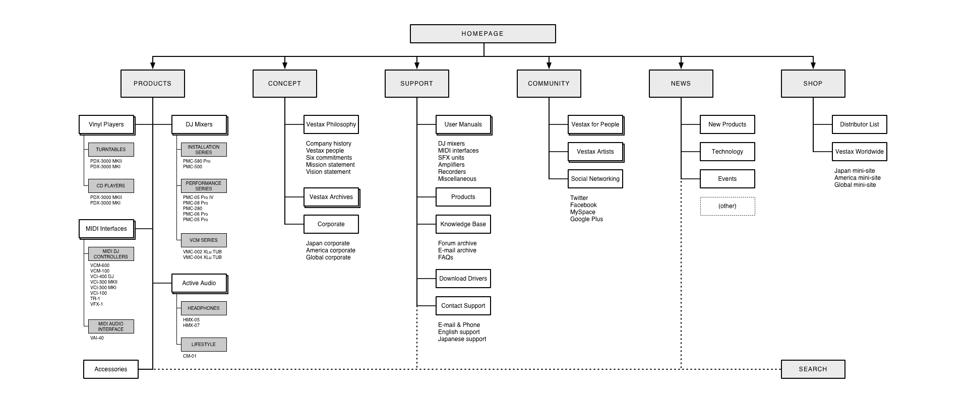
One of the redesign requirements from Vestax was that the site's layout, user flow and visual identity to not deviate too much from the existing experience. In addition to search engine optimisations, many third party retailers would directly link to the Vestax product pages and these hard-links could not be broken.
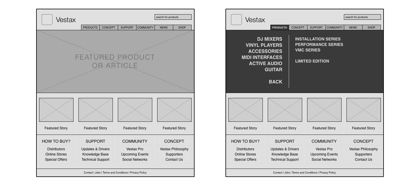
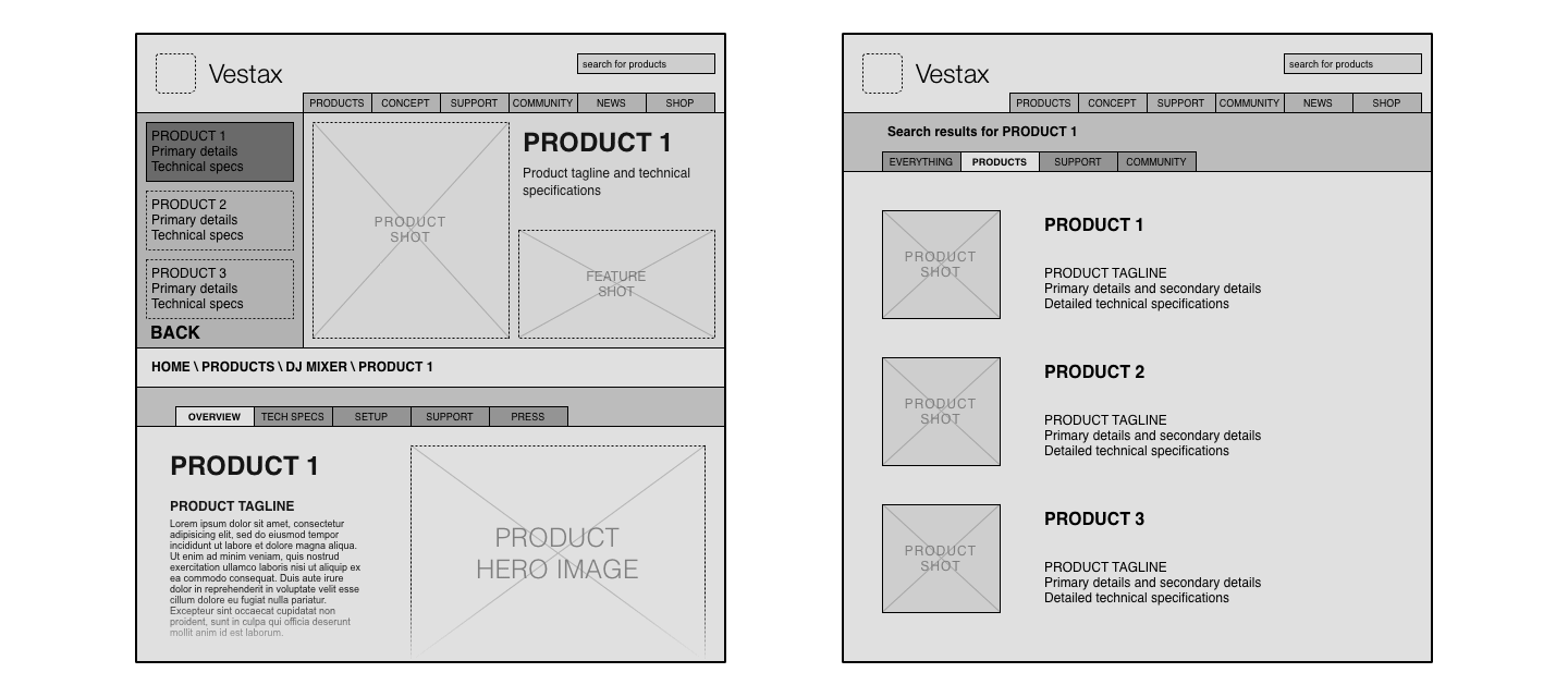
With a massive head-start over its competitors, Vestax had a distinct visual style separating itself from other major players in the market. Since their introduction in 1977, all Vestax turntables and mixers are characterised by an aircraft aluminium shade of grey, jet black accents and the signature 'mean red' reserved for the logo and points of focus. One of the important aspects of the redesign was to translate this visual identity over to the web presence as definitively as possible.
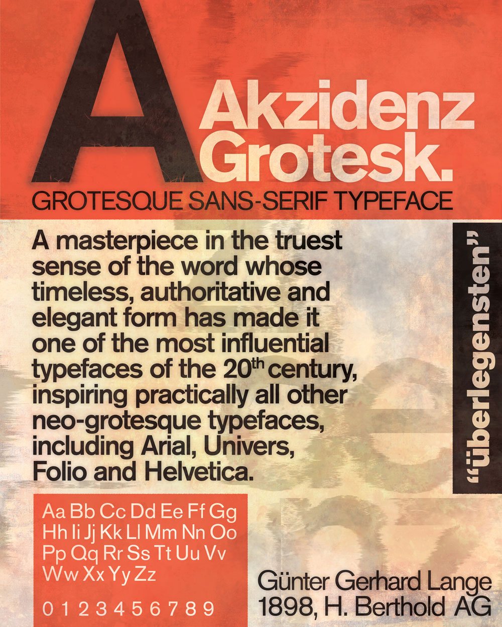
Type posters that won the first prize at the Academy of Art SpringShow 2011. The posters were first draughted on paper followed by layouts in Adobe Illustrator and were finally textured and prepared for print in Adobe Photoshop.
© Ashish Gatne · San Francisco, California.