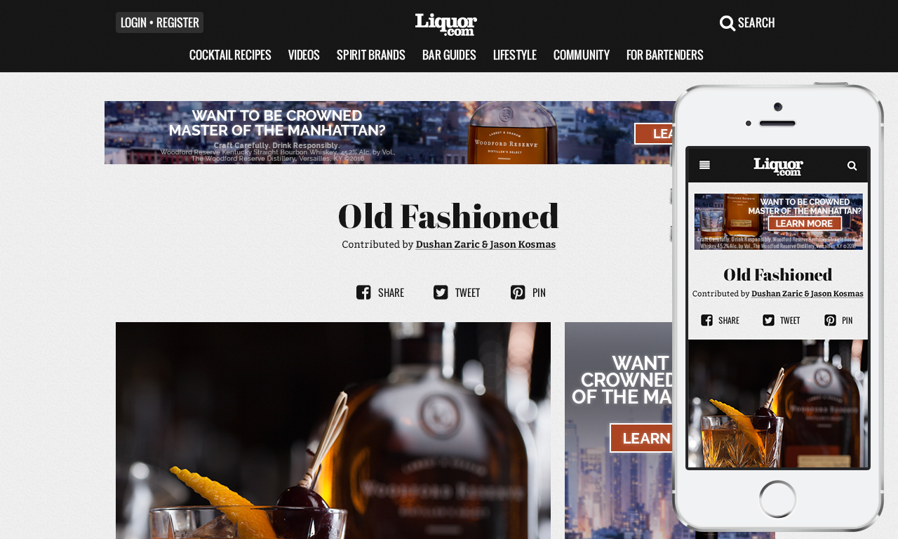
I designed Liquor.com's user experience to extend their presence to touch-based and mobile devices. Over 5 years, this helped them scale from 1 million to 40 million monthly visitors. Additionally, I designed the responsive e-mail templates that serve 2 million subscribers. Today, Liquor.com is the world's leading digital content brand for mixology and cocktail culture. In October 2019, Liquor.com was acquired by Dotdash, one of the largest online publishers.
Project Goals
Responsive behaviour:
Liquor.com's audience come from a wide range of devices from smartphones to desktop computers and a range of browsers on each of these devices.
Optimised content:
All of the site's content had been search-engine optimised and the redesign had to ensure navigation, referral traffic and page-view figures improved.
Simple layout:
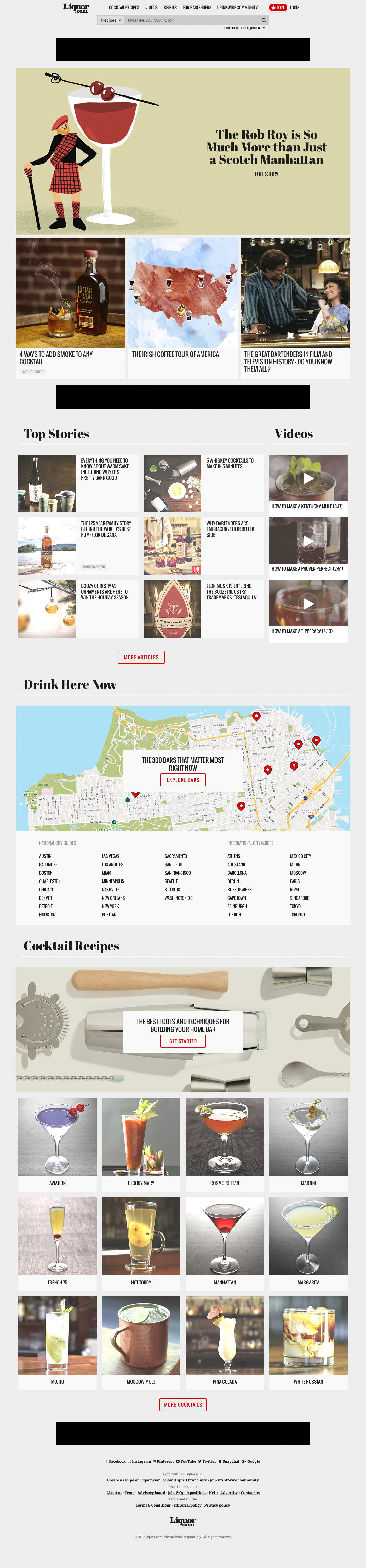
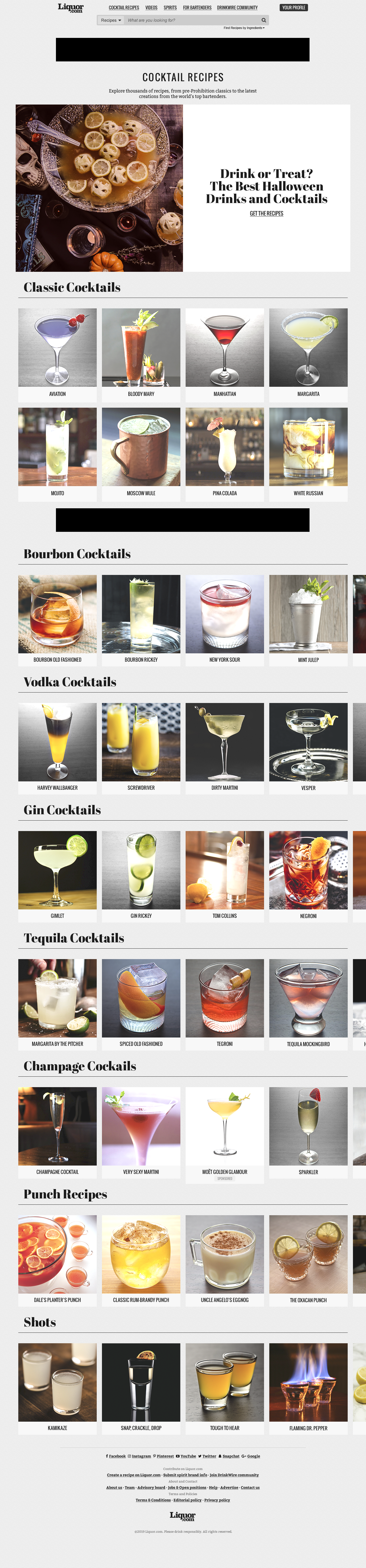
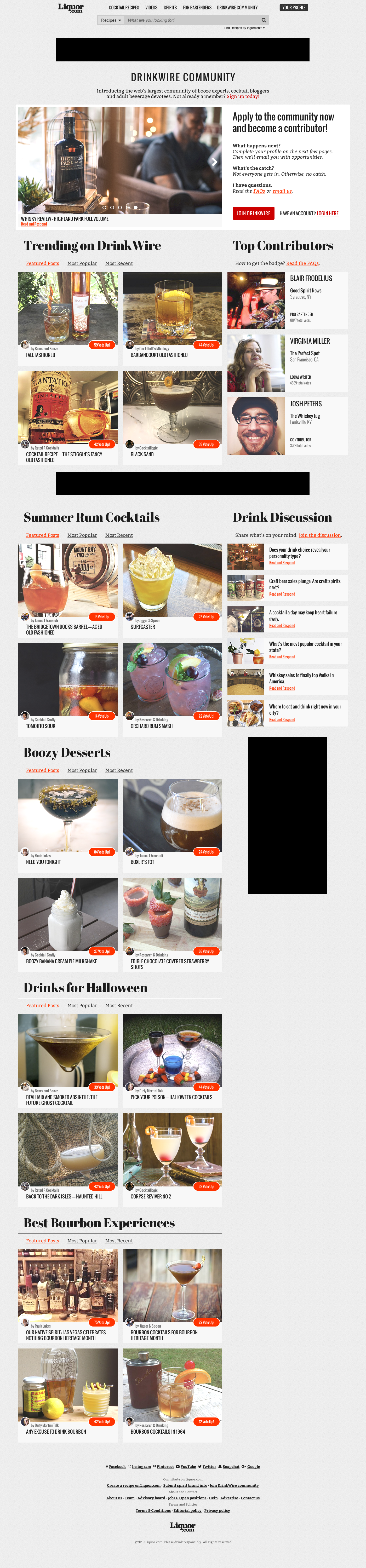
A simple and beautiful layout ensured the redesigned website was faster to scan and navigate and focus was on beautiful imagery, editorial and content.
Improved performance:
Optimised images, modular layout and a minimalist interface ensured snappy performance since most of the incoming traffic was over cellular data.
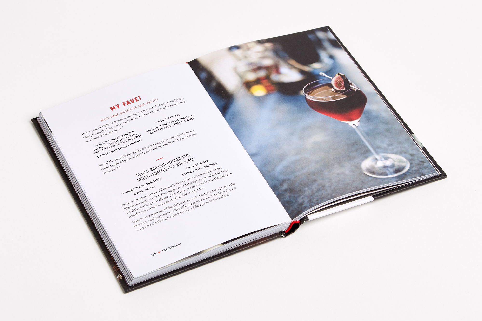
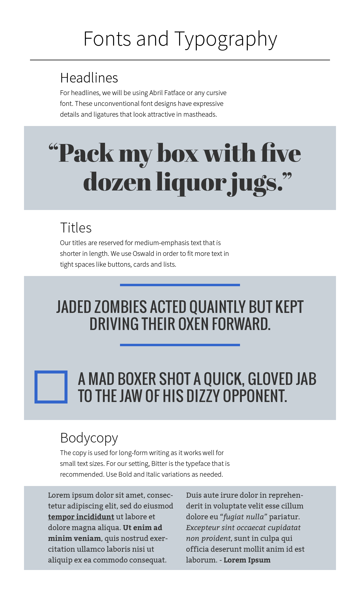
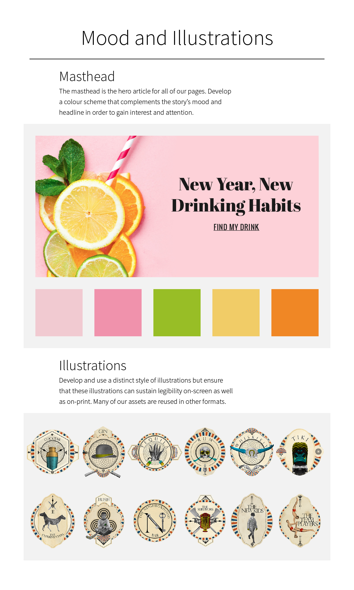
For inspiration, I looked at everything from prohibition-era cocktail books to modern mixology guides. They all had a few things in common: Bold, geometric headlines with elegant serif typefaces for the copy; Clean layout with plenty of white space and restrictive use of colour; Great photography, graphics and illustrations stand by themselves.
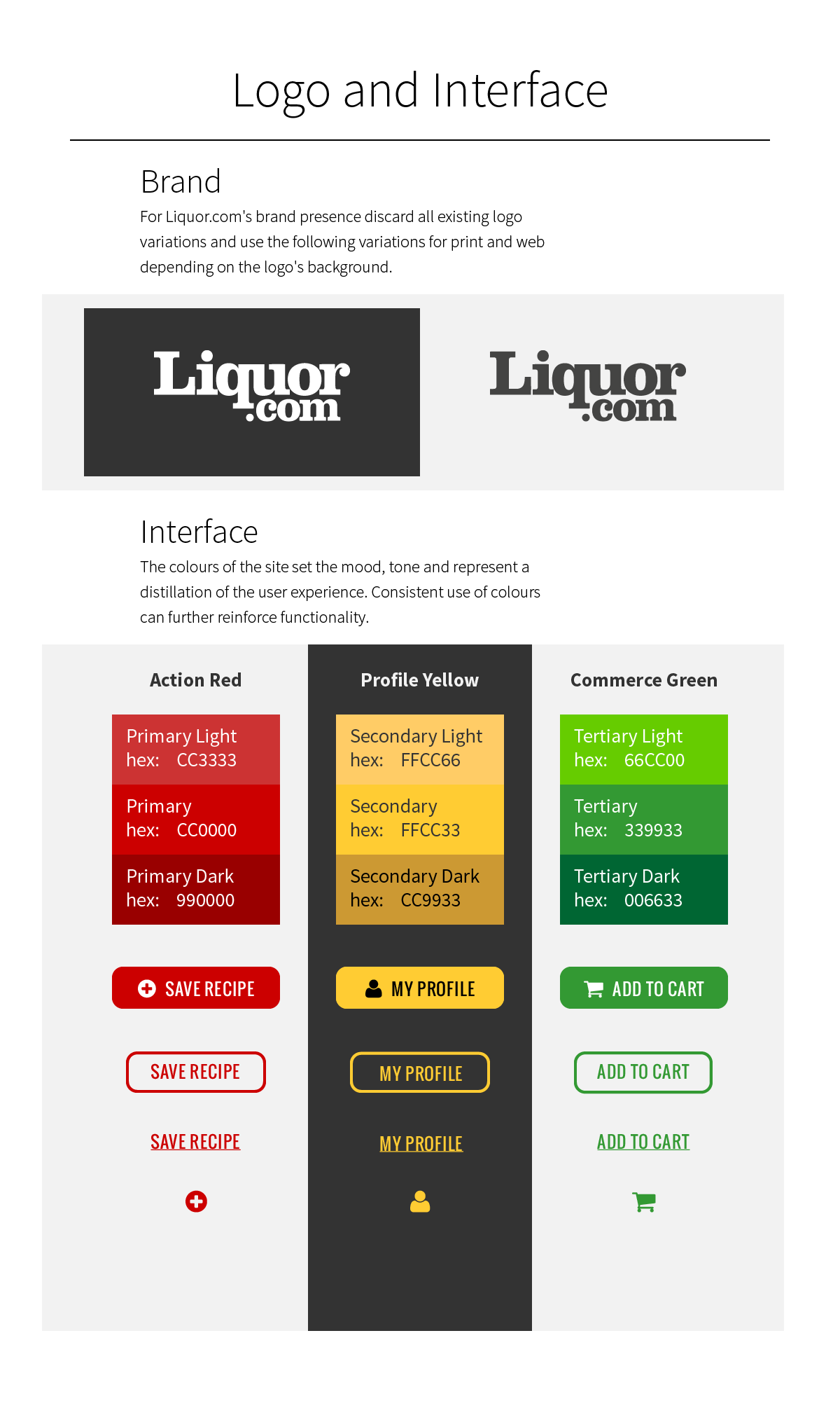
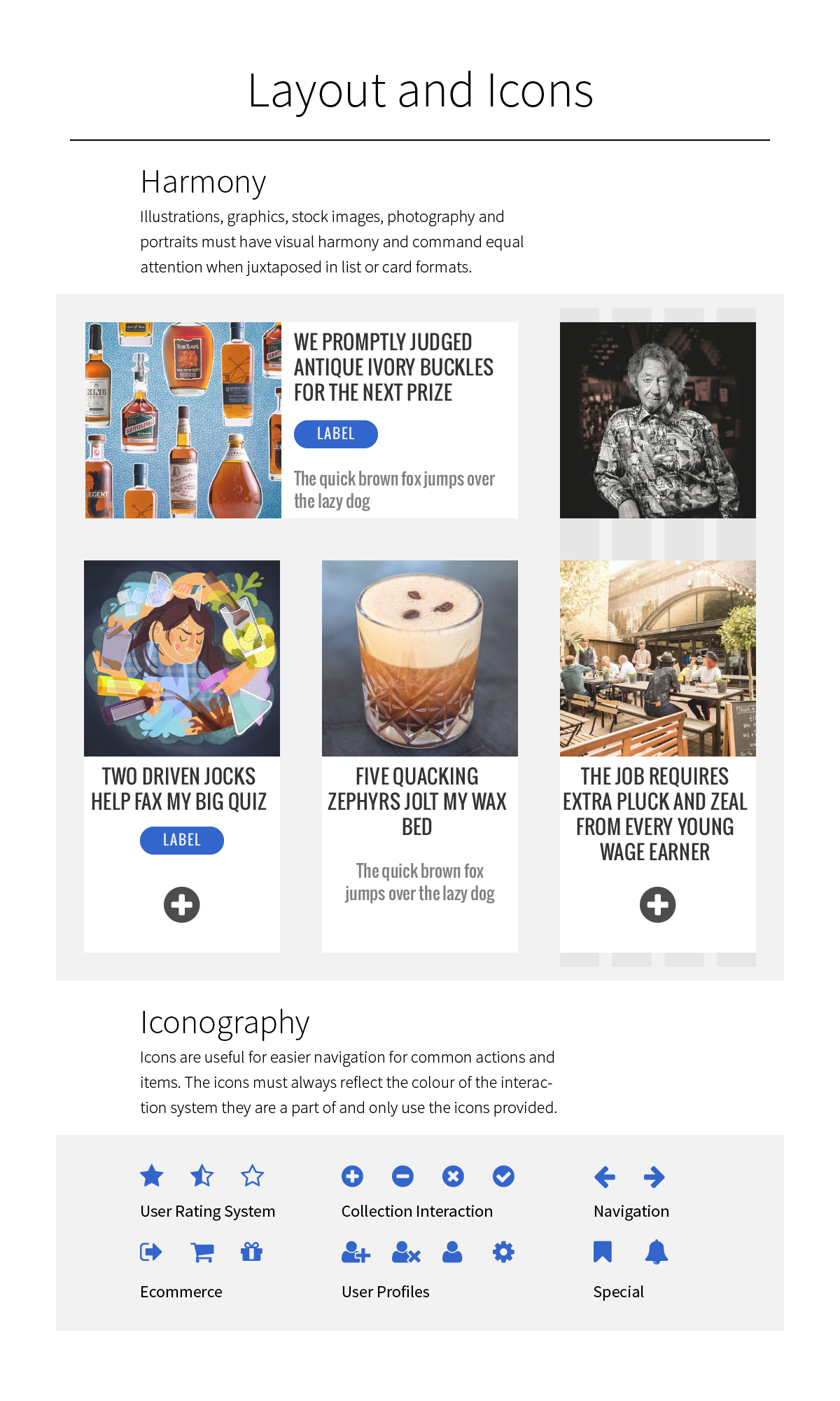
I tried to extend the visual inspiration guidelines and added a didone-inspired typeface that looks beautiful on the site's mastheads. Illustrations were created to compliment the site's print assets and finally, a new set of visual design rules were put in place so photography, portraits, graphic design, stock photos and illustrations can be juxtaposed in harmony.
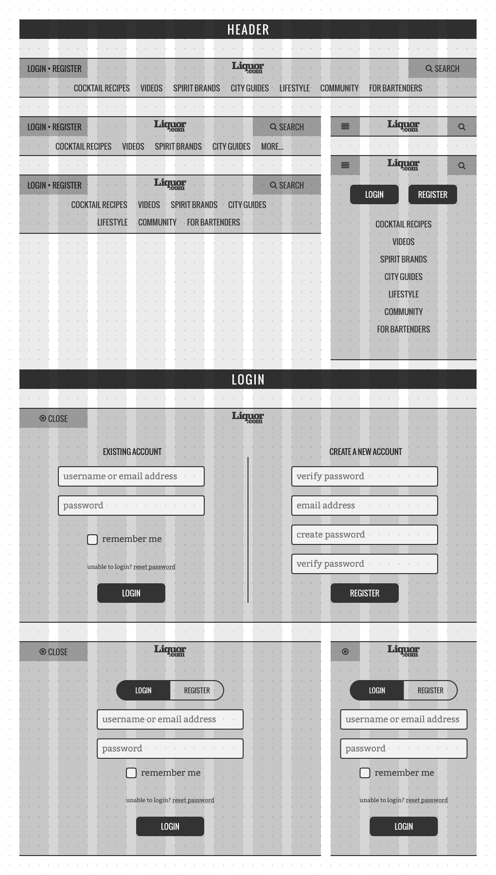
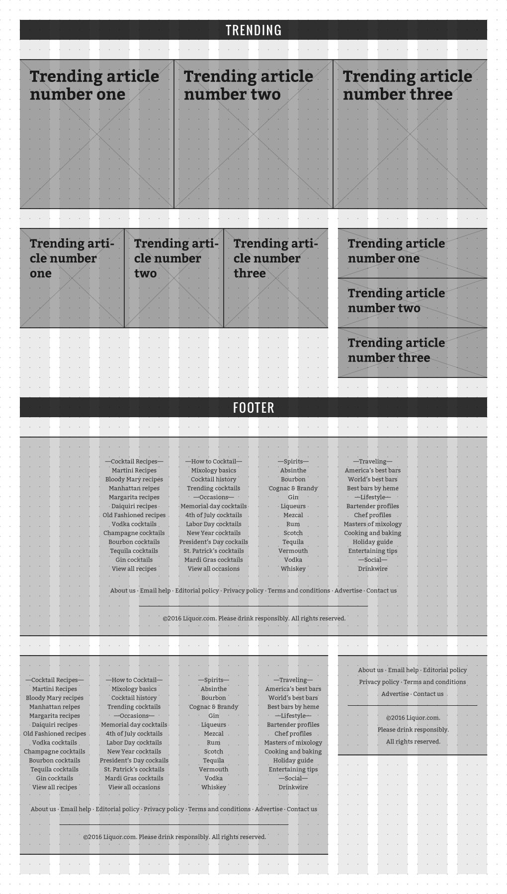
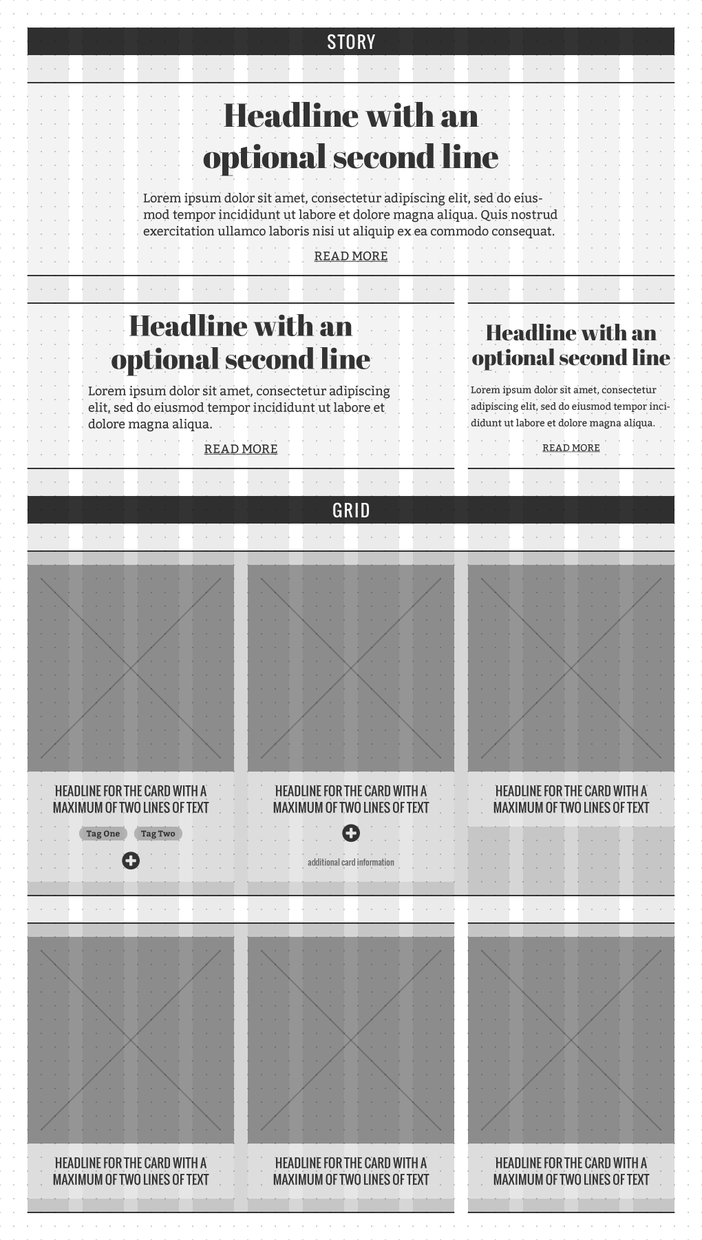
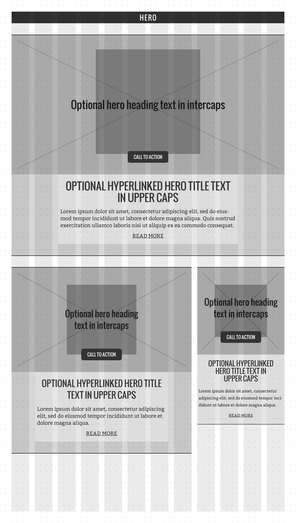
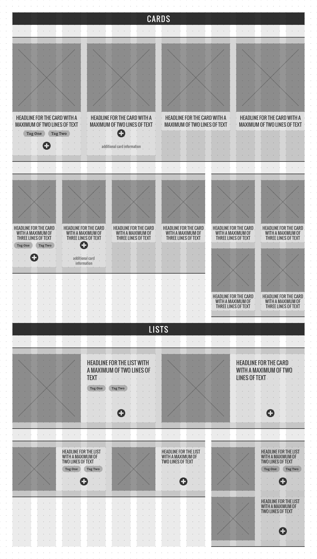
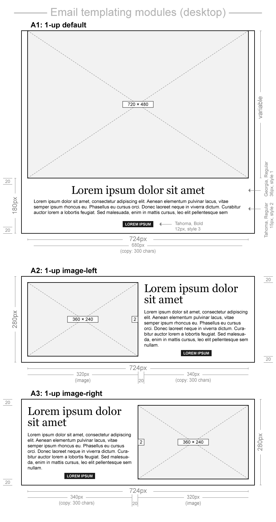
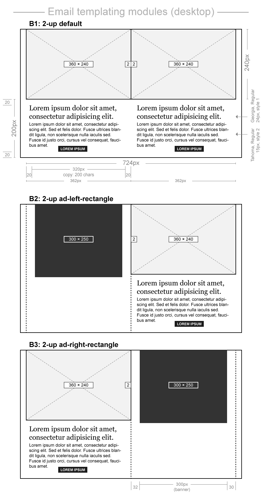
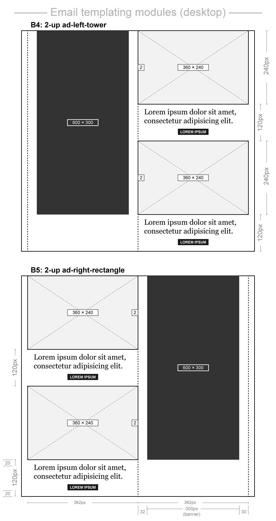
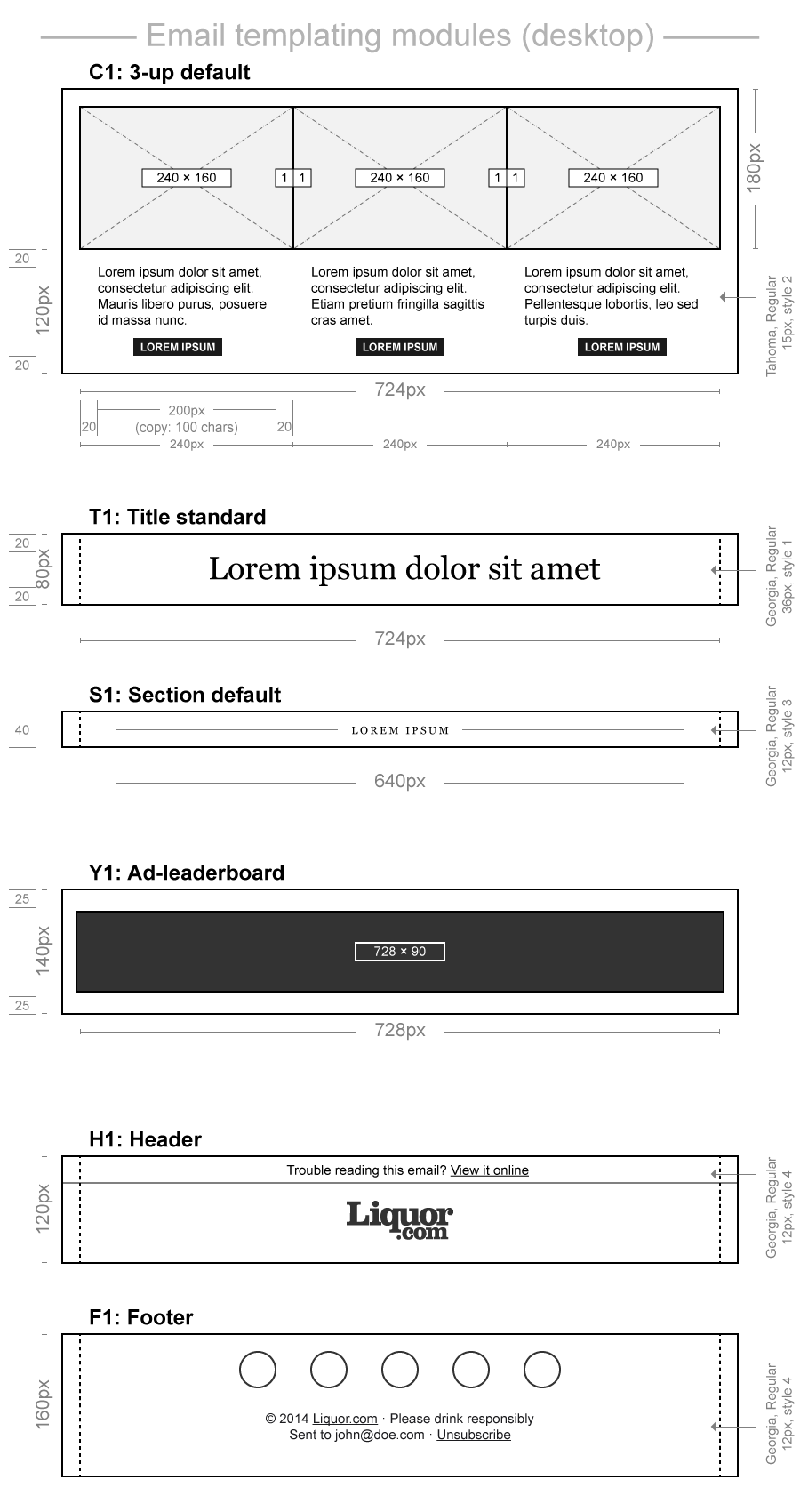
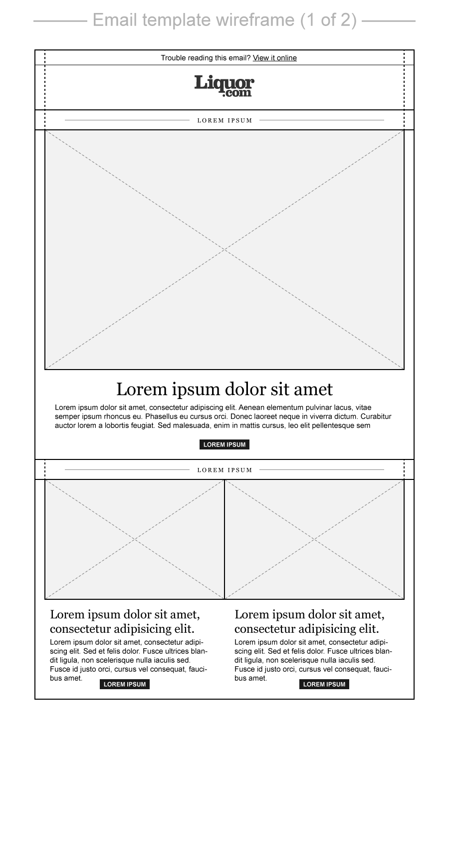
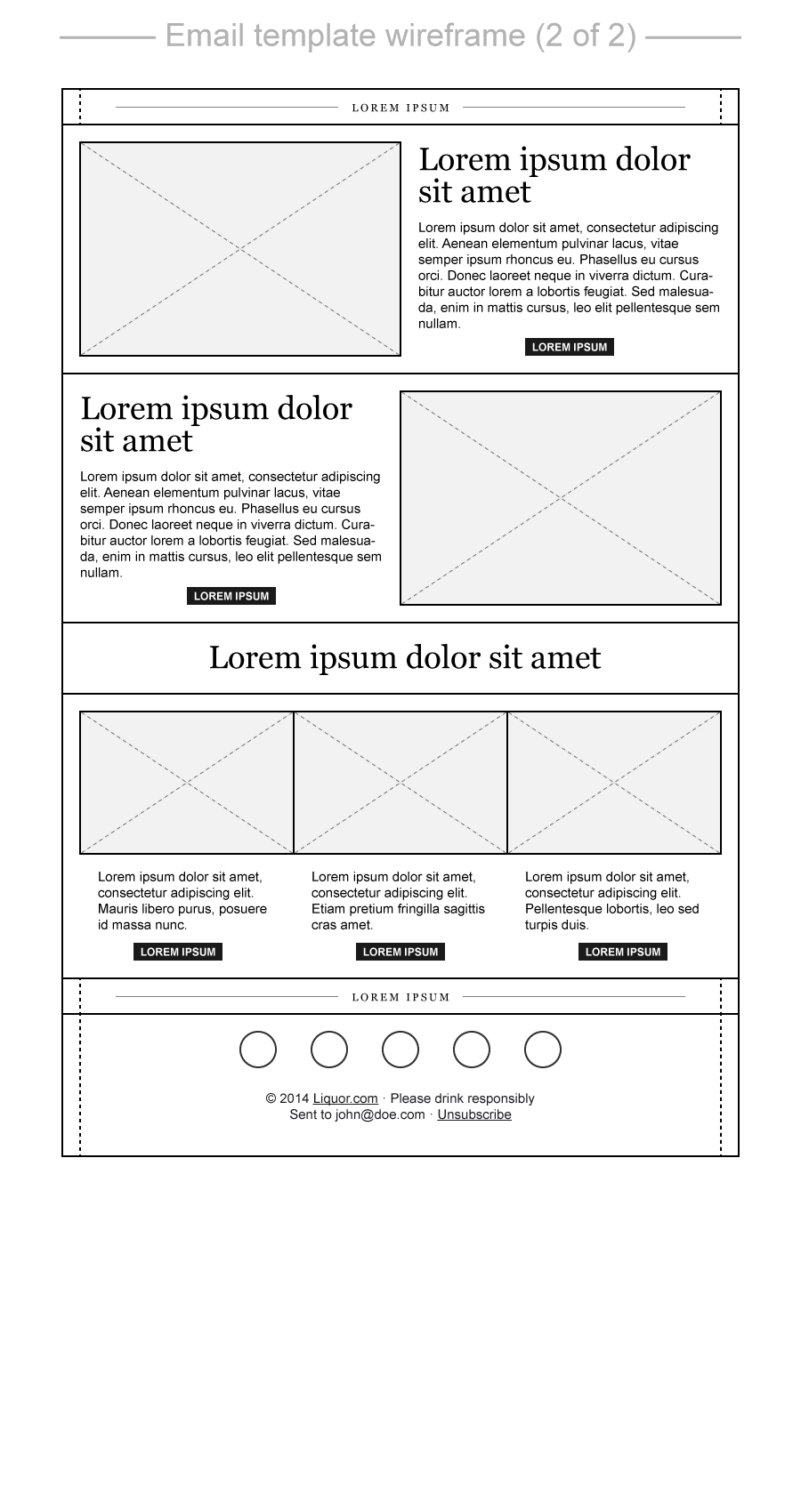
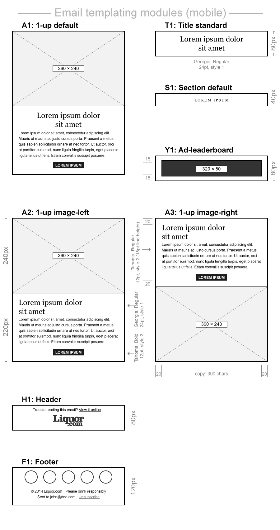
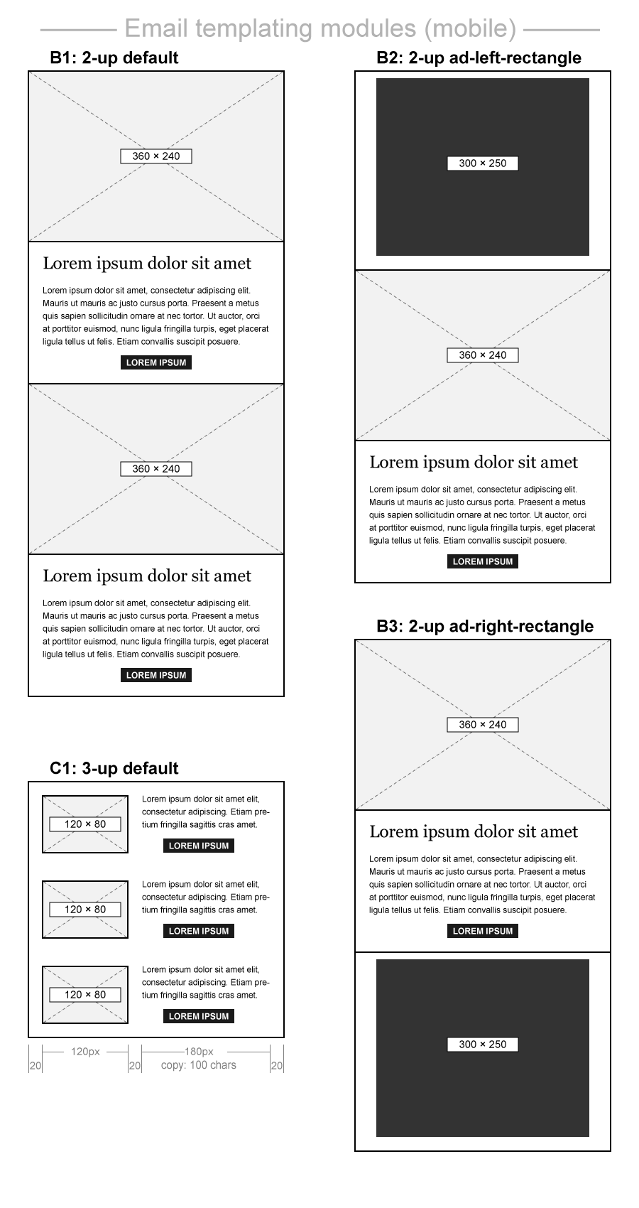
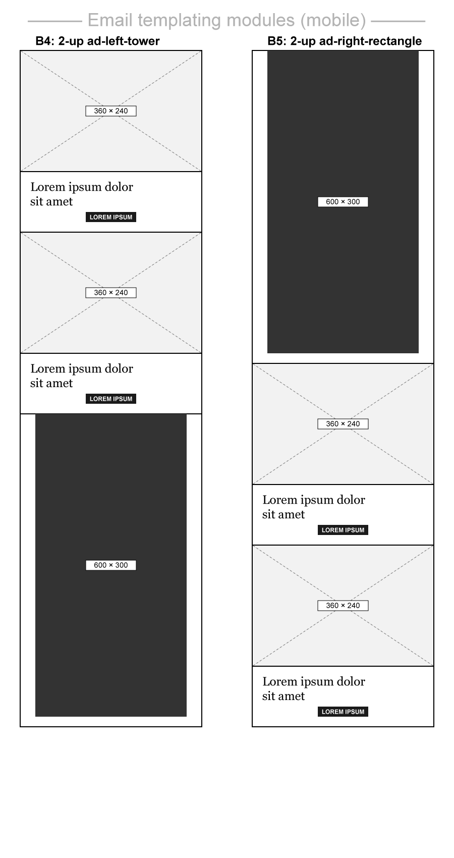
A module library comprising of reusable components had been developed based on the existing content before the redesign. This could allow us to create unique and interesting layouts addressing the needs of the sponsors and the editors. Secondly, development and testing were far easier as the entire site's layout, interaction models and responsive behaviour could be reduced to the building blocks shown below.
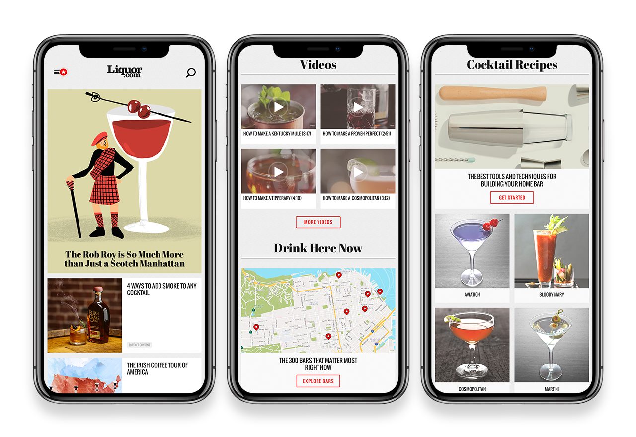
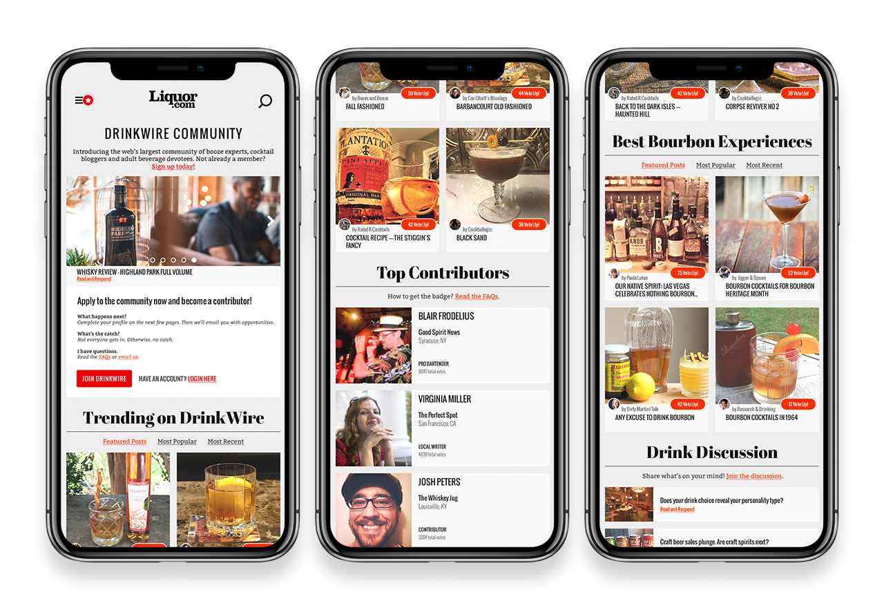
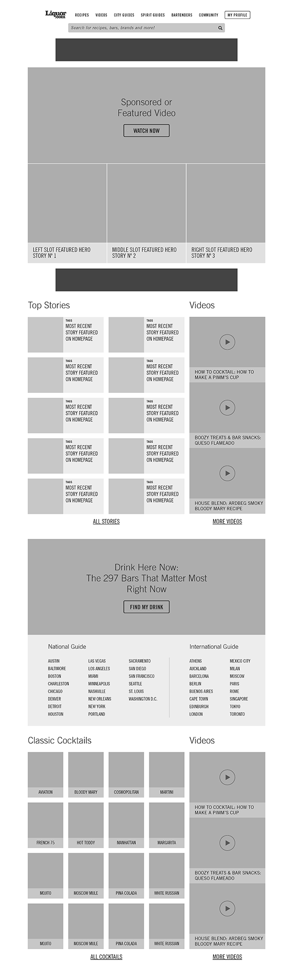
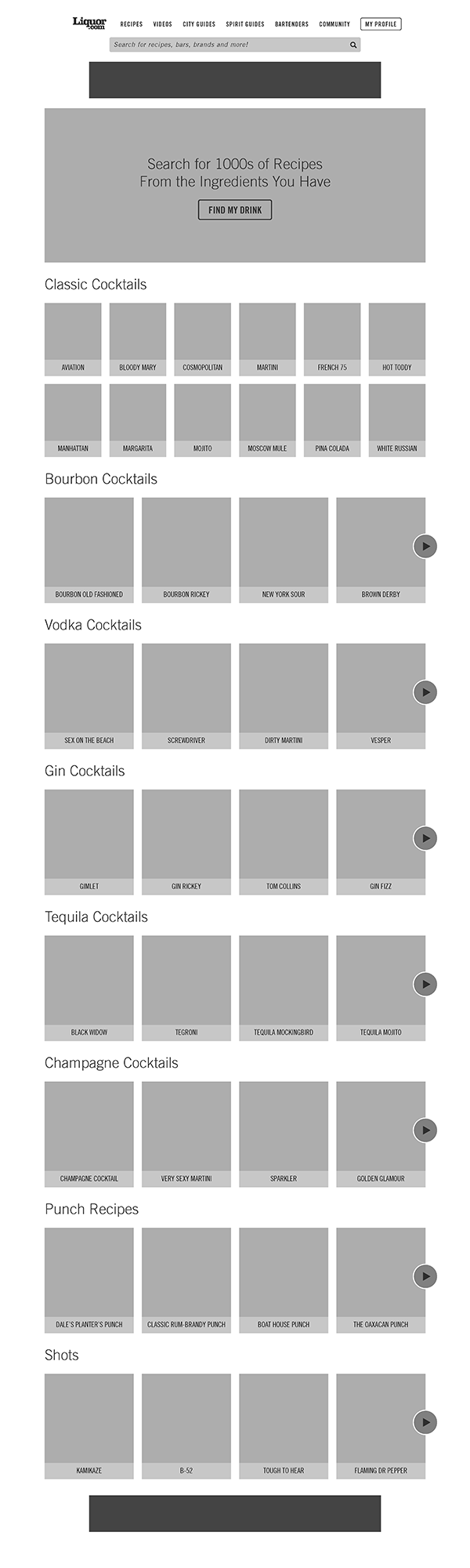
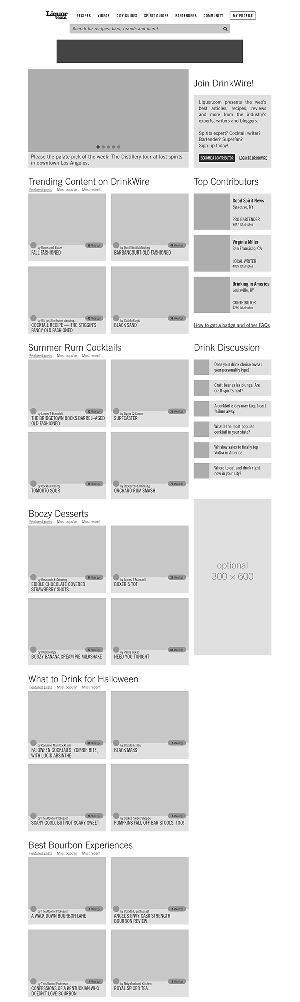
I then looked at the highest performing sections of the site and optimised the site layout without compromising the search engine optimisations or the site taxonomy. The next logical step was to develop the wireframes based on the new reusable module library. I took a mobile-first approach and ensured that the layouts would scale gracefully on larger screens.
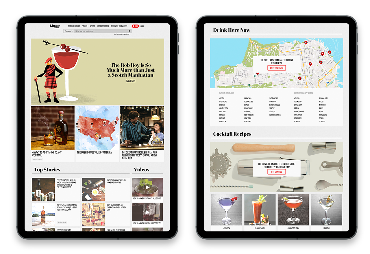
Lastly, after combining the style guide, module library and the wireframes, I developed the visual mockups for desktop and mobile. These screens showcase how photography, illustrations, typography, layout and colour schemes work in conjunction with one another and helped us achieve the print-inspired visual design for Liquor.com
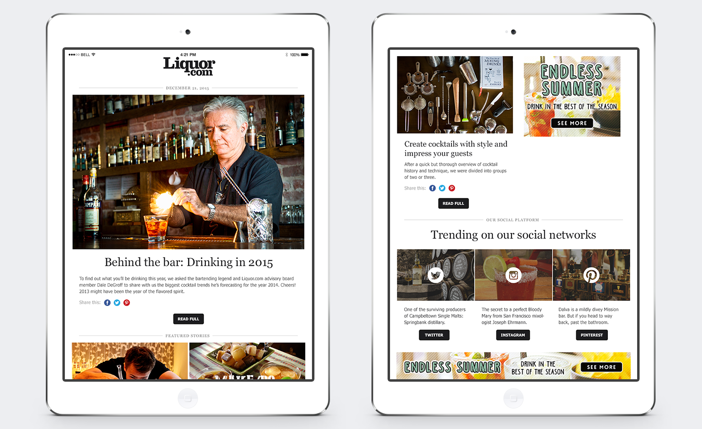
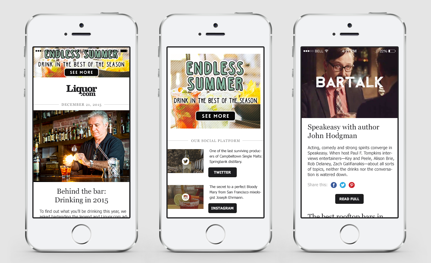
Since no responsive email template solution was available at the time, one had to be developed in-house to meet the needs of the editors and sponsors. The majority of the subscribers checked their e-mails on mobile devices so it was important to ensure emails looked great both on large and small screens with the layout and content adjusting itself accordingly. Additionally, the modular approach of the e-mail templates allowed producers to change the layout for each edition with very little coding.
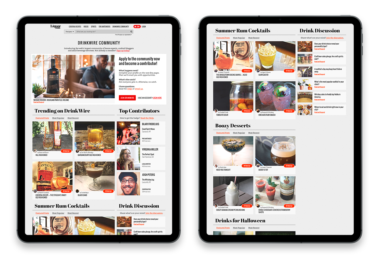
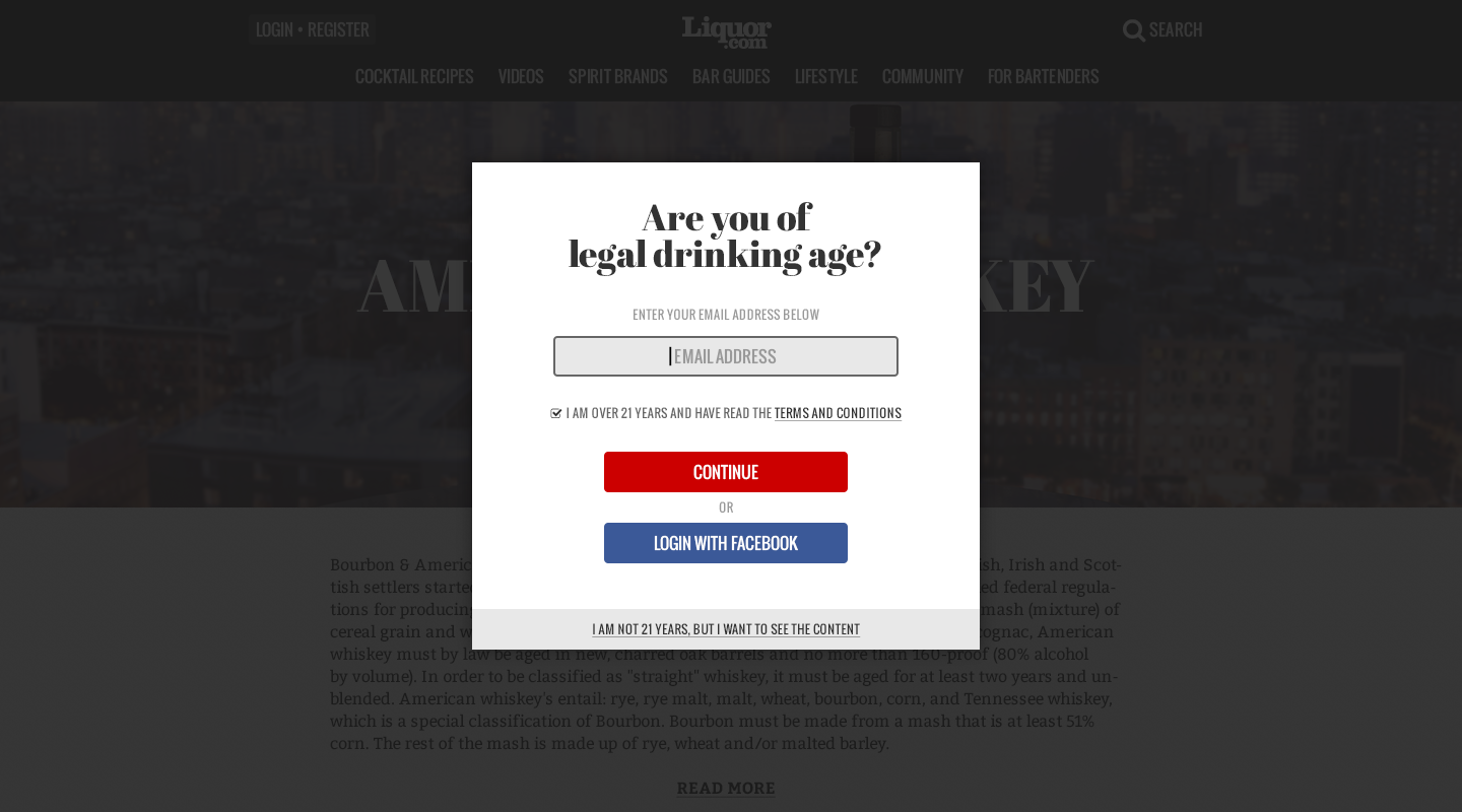
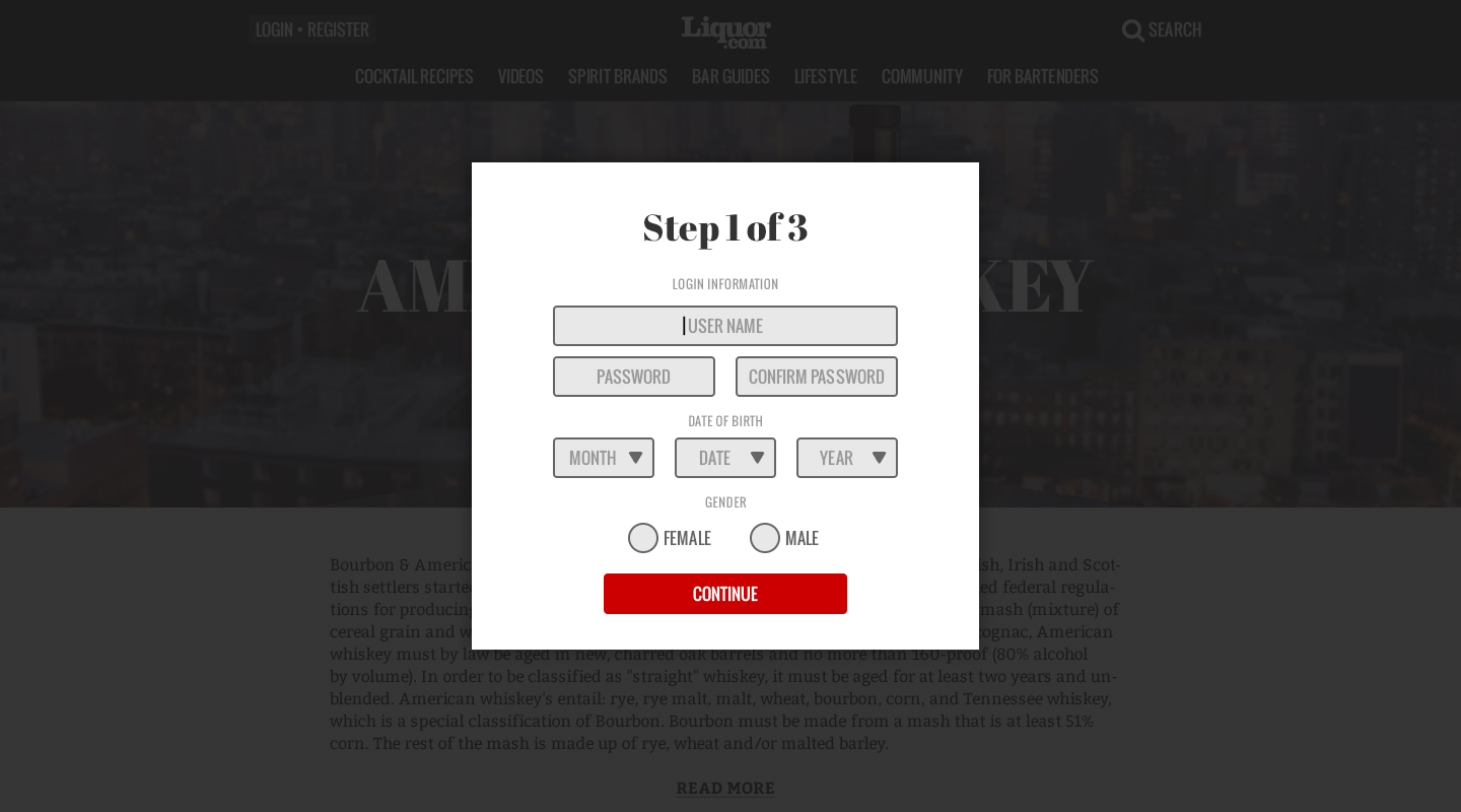
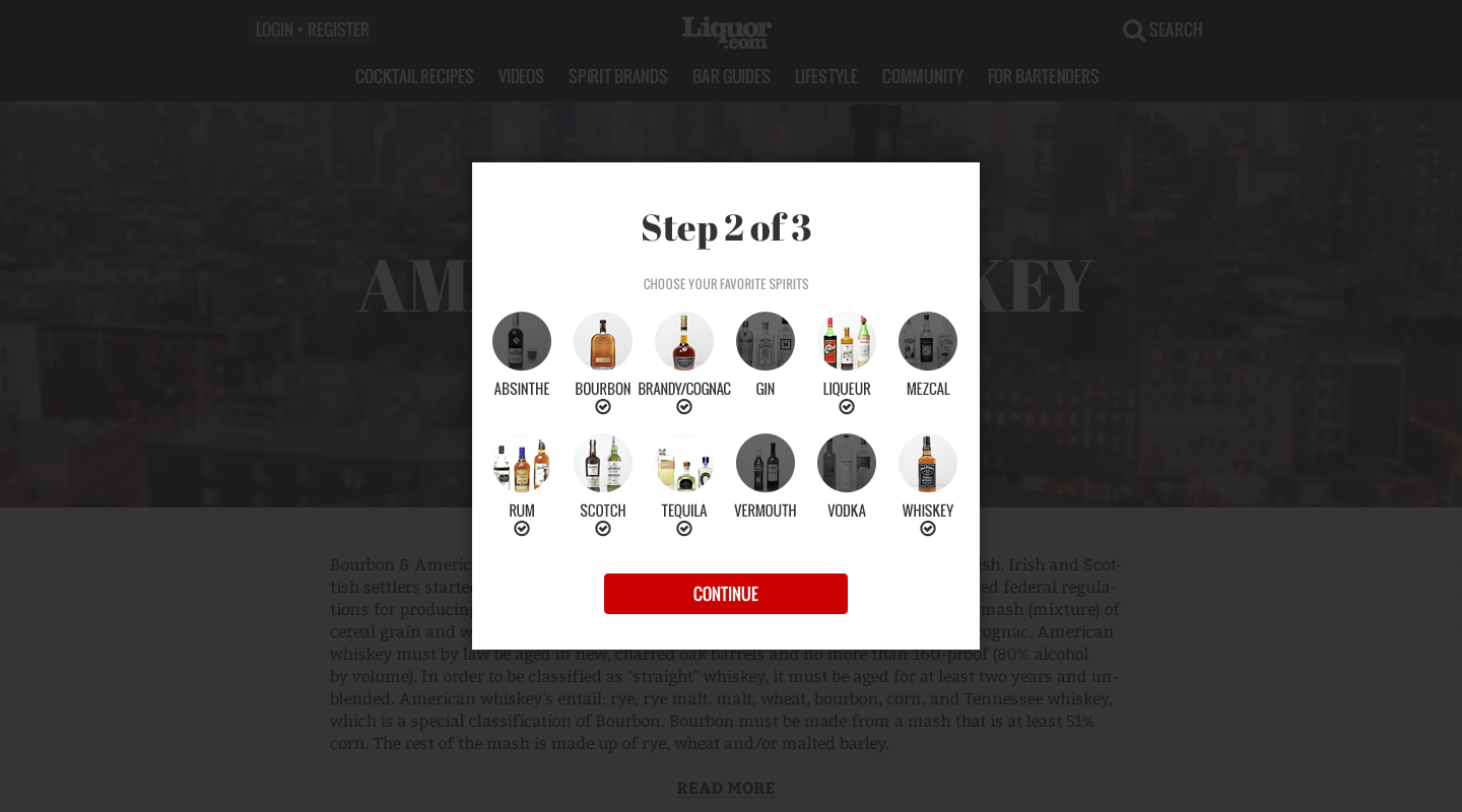
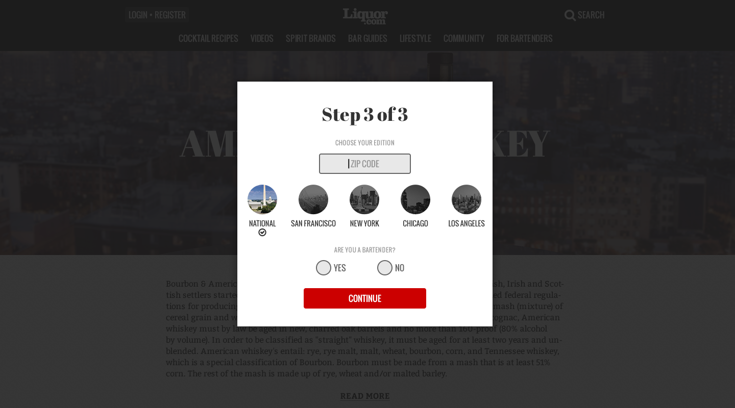
This section covers how the site's user-centred design translates to real world use case scenarios. For audience development, the site traffic needs to be converted to an e-mail subscription in order to grow the user base. However, landing modal windows lead to a higher bounce rate and this design attempts to address the continuing challenge of high sign-ups while minimising the bounce rate.
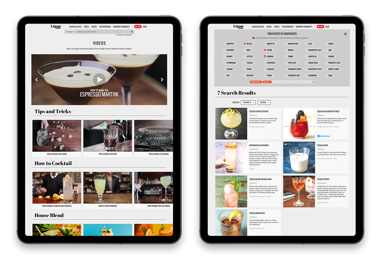
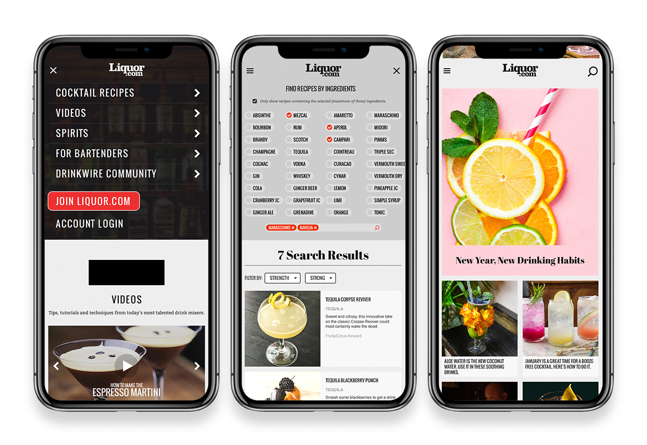
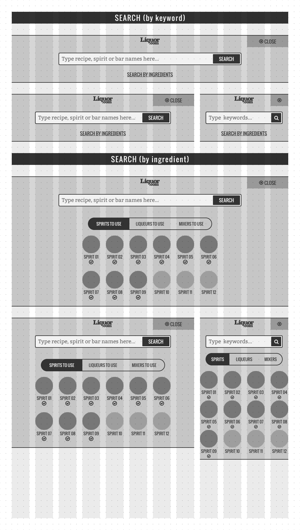
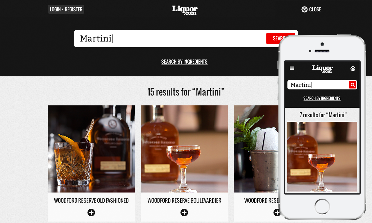
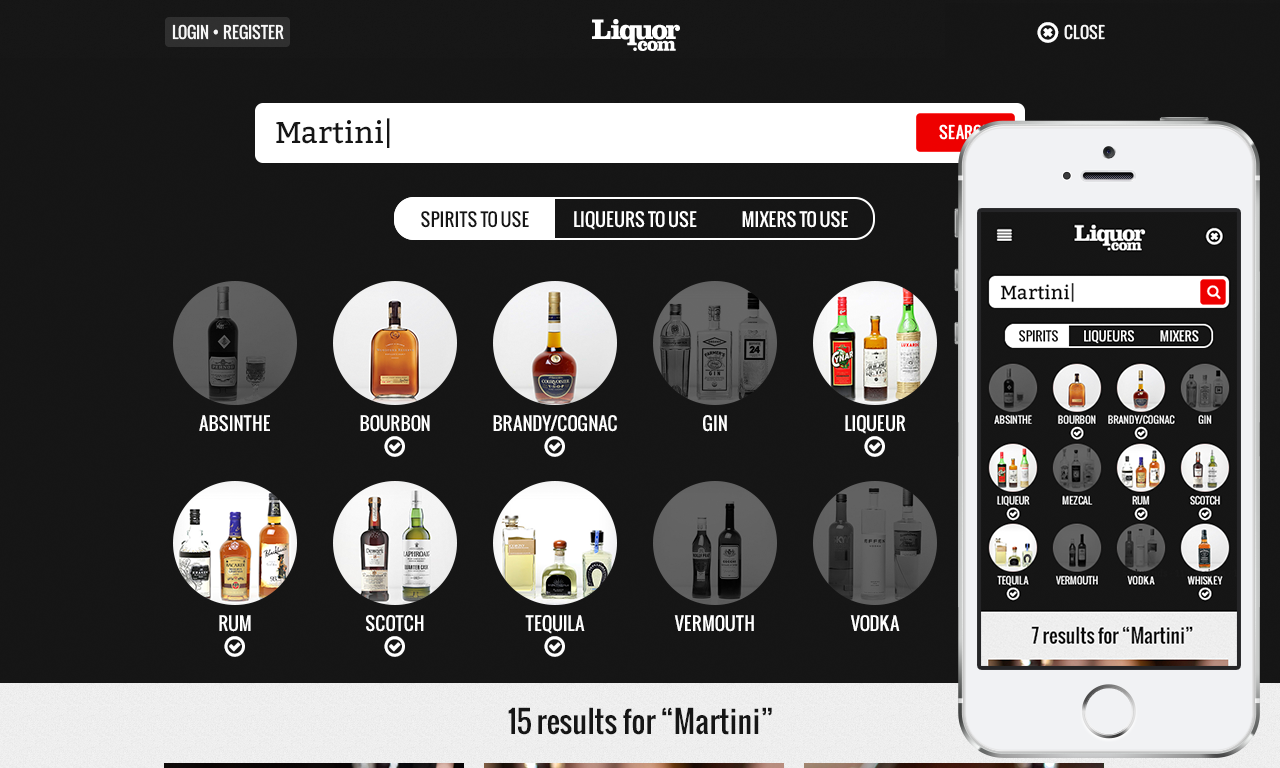
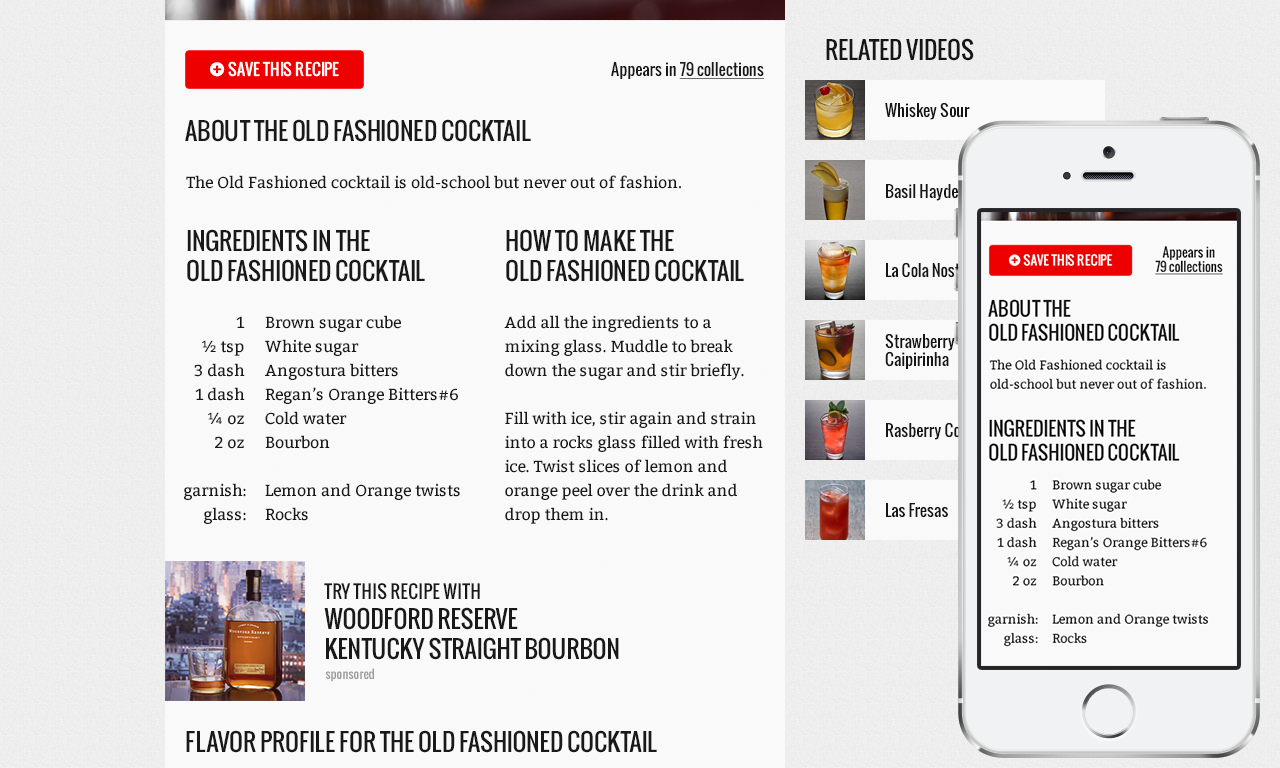
All user-centred features are developed based on real-life use cases such as being able to search for cocktail recipes by name or ingredients. Users can then save these recipes to curated lists or collections that can be shared with others or saved privately to their profiles.
Search is a key feature of the website and users are able to invoke the search dialogue from any point on the site. After doing so, they can either type the name of the cocktail (example: Martini) or search for cocktails possible by ingredients (example: Gin and Vermouth). This allows users to search by cocktail name that they may know or search and create cocktails by base spirits, liqueurs or mixers they have available or wish to use.
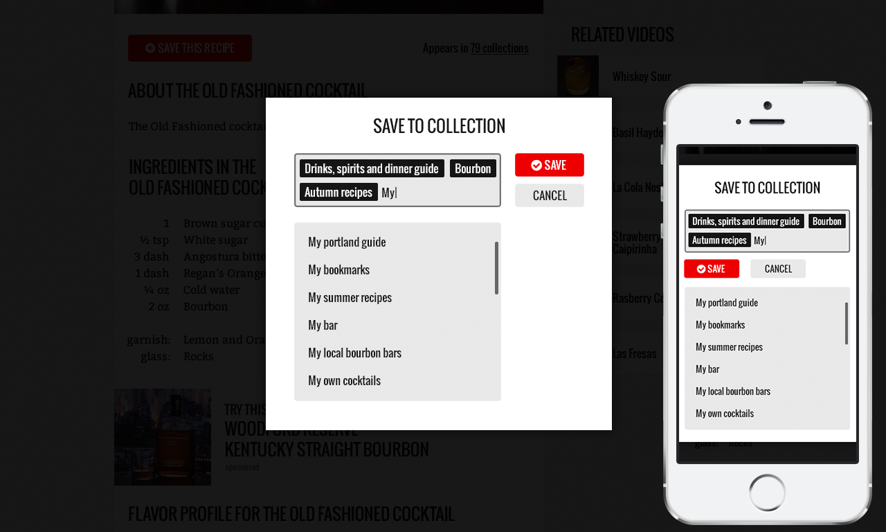
Collections is a way of organising and saving articles, recipes or locations into user generated lists (example: Bars in San Francisco). This allows users to continue exploring more content on the website and fetch their favourite content later. Curated collections can also be shared with other users on the website or through social media. Registered users can browse other users' collections and add items to their own with a simple click of a button.